Credibility
Branding a global treasury consultancy and financial aggregator.
A CFO is reviewing their banking relationships: too many providers, too much friction, and no single point of accountability. They’ve heard about ECAP through a contact, so they search the name.
All ECAP work (2)At a glance
- Brand identity
- Visual system
- Website
- Photography
- Print and collateral

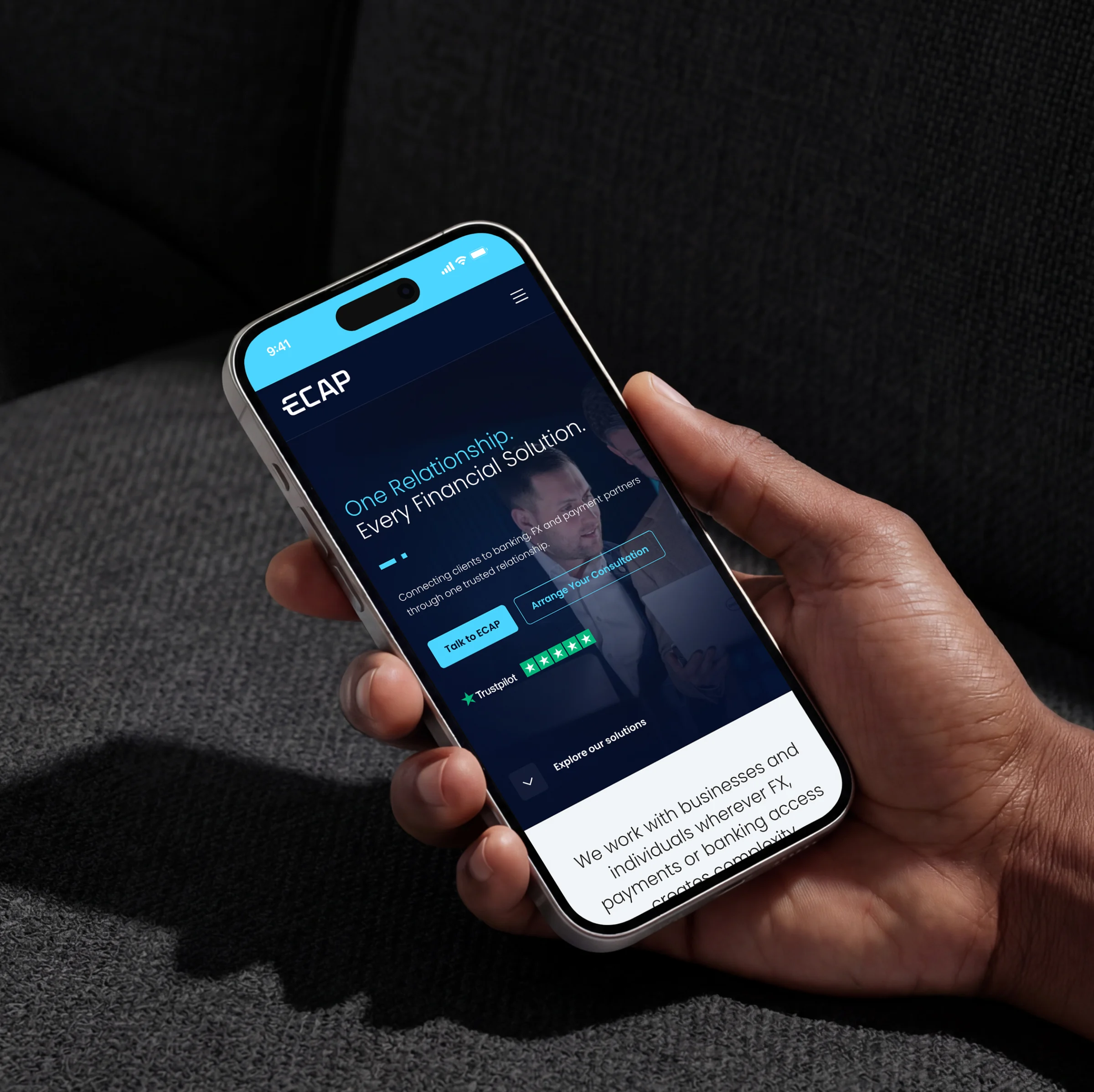
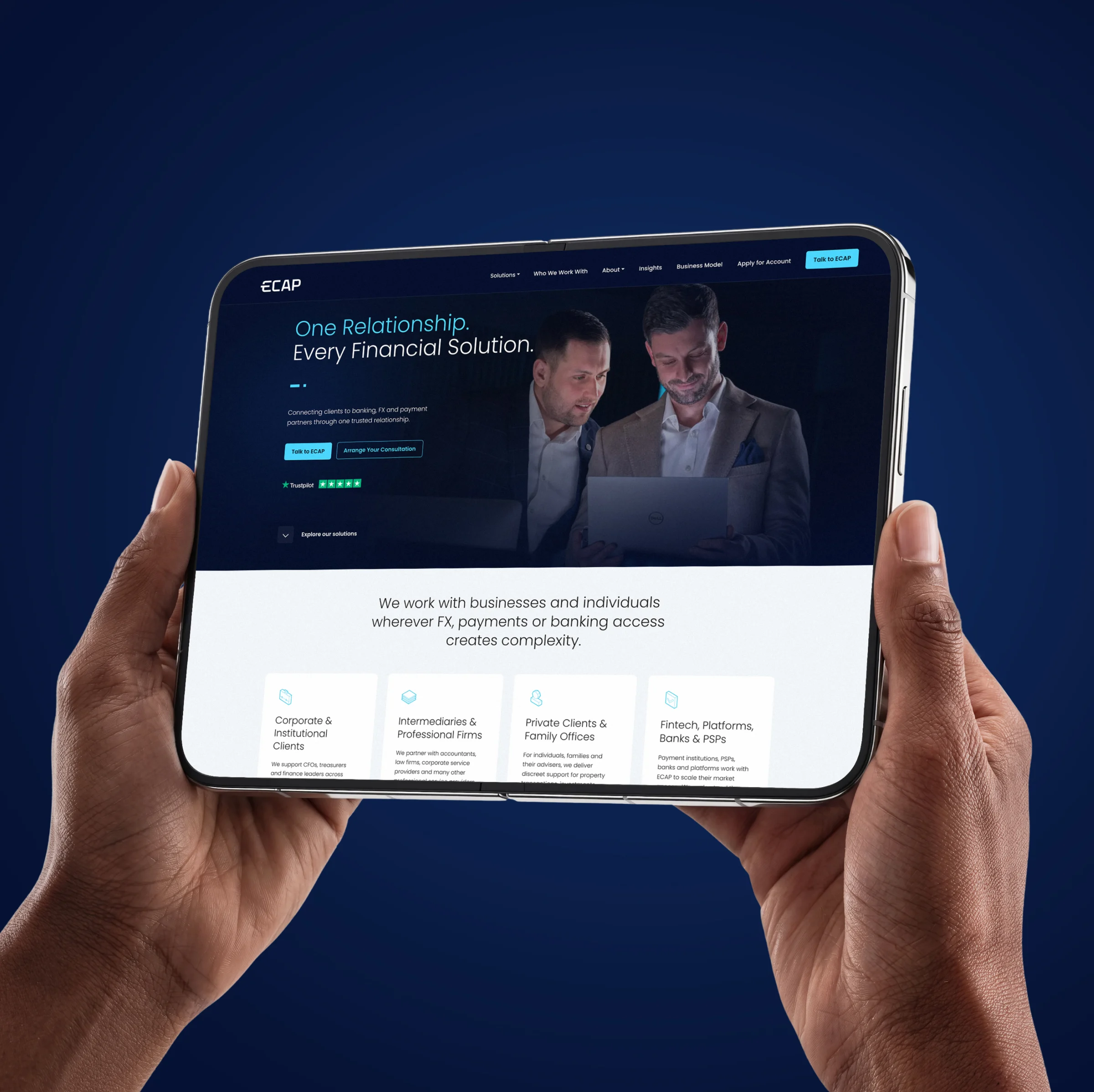
The website they find doesn’t yet reflect the firm behind it. The referral described expertise, relationships and scale, but the digital presence hasn’t caught up. They don’t leave, but they hesitate, and in financial services hesitation is expensive.
ECAP is a treasury consultancy and financial aggregator, bringing together foreign exchange, payments and banking access through a single client relationship. It has over 30 years of combined experience, eight regulated partners and access to 140 currencies, with corporate, institutional and private clients across global markets.
The proposition is built on trust, expertise and discretion. The brand and website needed to communicate all of it clearly, to the right people, from the first moment of contact.

Make the outside match the inside
The brief was to build a brand and website that reflect the calibre of the firm behind them: more considered, more credible and more precise, rather than louder.
Brand identity
The existing logo had the right bones but lacked resolution. We refined it, sharpening the geometry of the E mark so it feels modern, distinct and authoritative without losing its familiarity. It holds its confidence at any scale, from a business card to a large-format application, and sits naturally in the regulated, high-trust settings ECAP works in.
Visual system
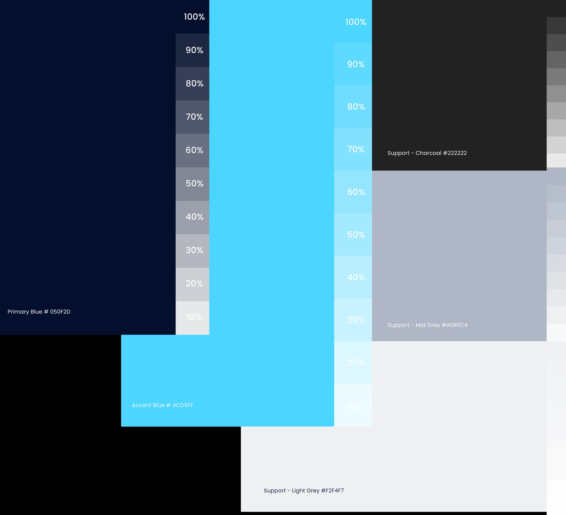
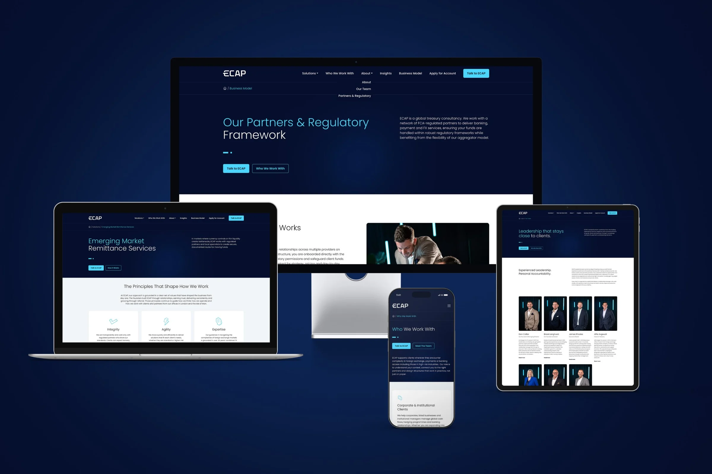
Deep navy, structured typography and a restrained accent colour, with generous white space so the system works as well in print as on screen. It signals institutional credibility without feeling impersonal, and it speaks in plain language rather than financial jargon.
Photography
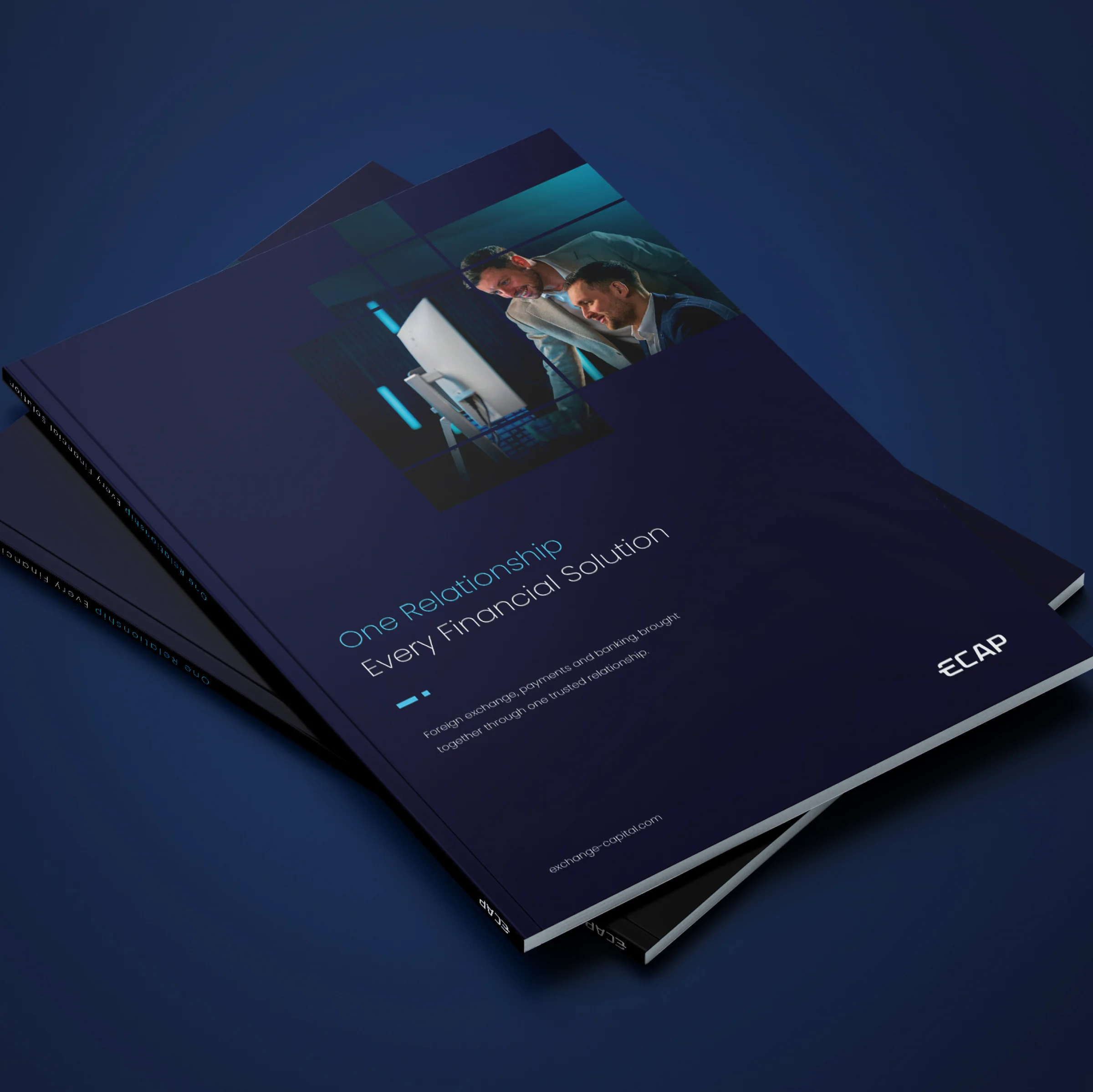
Original photography of the founding team, shot to show the relationship-led nature of the business: two people working through a problem together, unposed and not stock. It’s the kind of image that makes a prospective client think these are people they could trust with a complex problem.

What the brand does now
ECAP now presents an identity that matches its track record. The website opens conversations rather than raising questions, and prospective clients see expertise, structure and accountability before a word is exchanged.
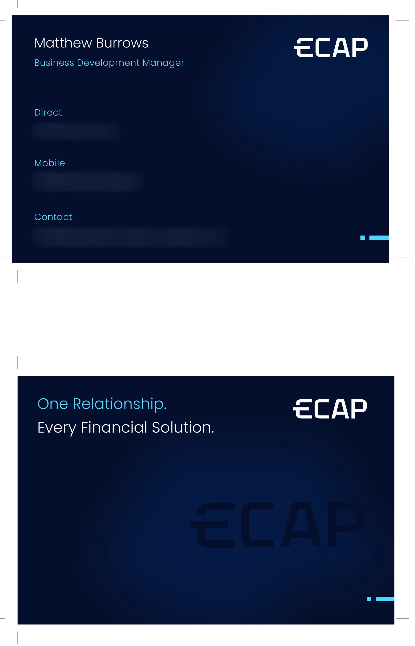
The brand is consistent across every touchpoint, from business cards and collateral to digital and physical materials, all drawn from the same system. It holds together because it was built as one thing rather than assembled from parts.
The quiet cost of outgrowing your image
In financial services, perception comes before access. Clients operating at scale choose their partners carefully, and the wrong first impression doesn’t just lose a conversation. It can close a door that may not reopen.
ECAP had built something significant: over $2 billion in transactions, a network of regulated partners and a team with decades of combined experience. None of that was visible to someone arriving for the first time. It is now.




Credibility has to arrive before the conversation does.
Related work.
![]()
![]()
![]()
![]()
![ACSP website membership and homepage pages displayed on tablet devices, designed and developed by DotPerformance for the Association of Corporate Service Providers]()
![West Coast Fitness logo embossed on orange printed material, part of the brand identity designed by DotPerformance for the Isle of Man fitness centre]() Case study
Case studyWest Coast Fitness rebrand
One brand for a Peel gym, from the website to the kit members wear.
View