A brand photoshoot and visual system for West Coast Fitness.
West Coast Fitness had already built the thing that mattered most. Real sessions. Real effort. Real loyalty from the people who trained there.
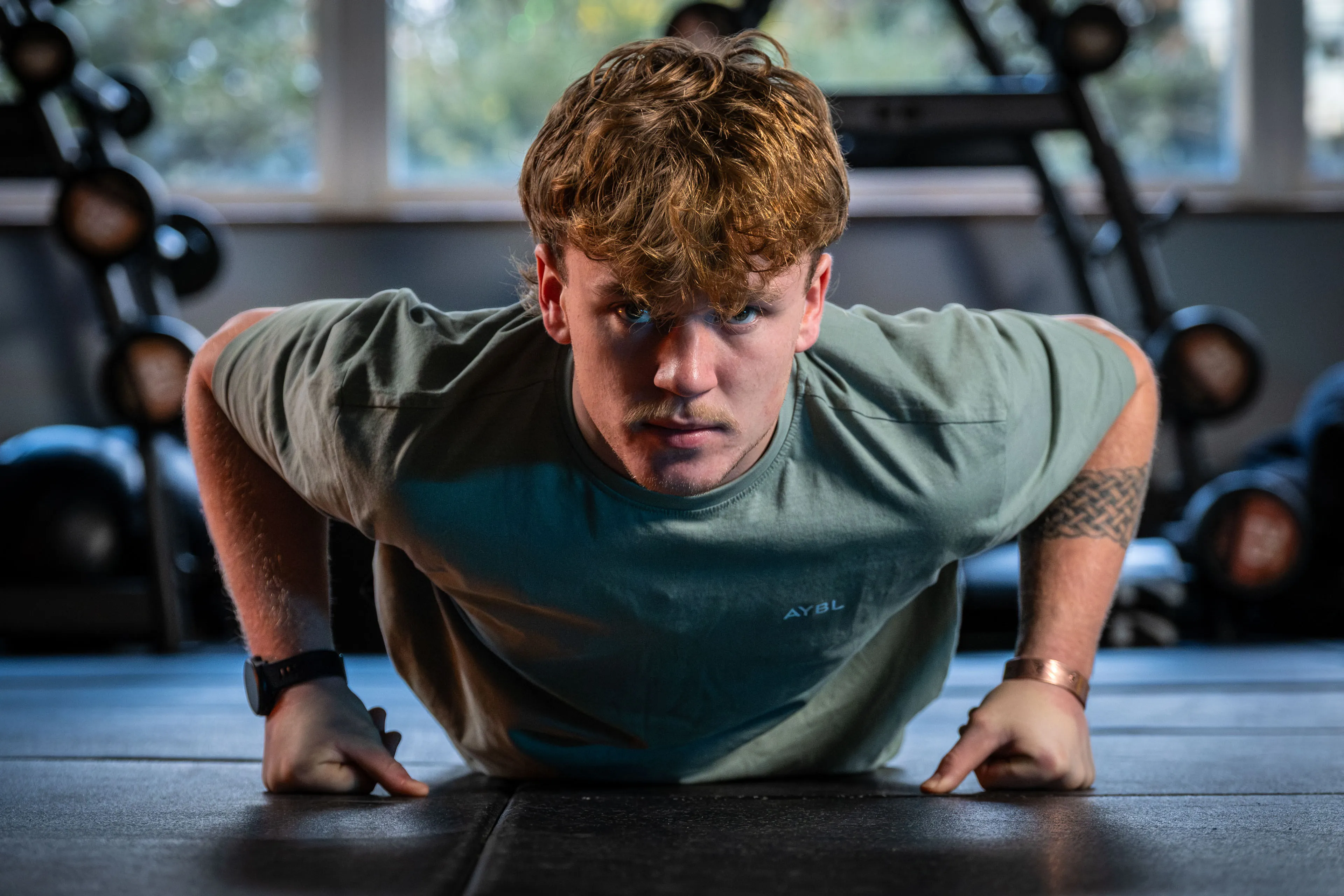
What it needed was a brand and photography system that reflected that properly. Not generic gym imagery. Not polished fitness clichés. A visual identity built around the energy, discipline and atmosphere that already existed inside the room.
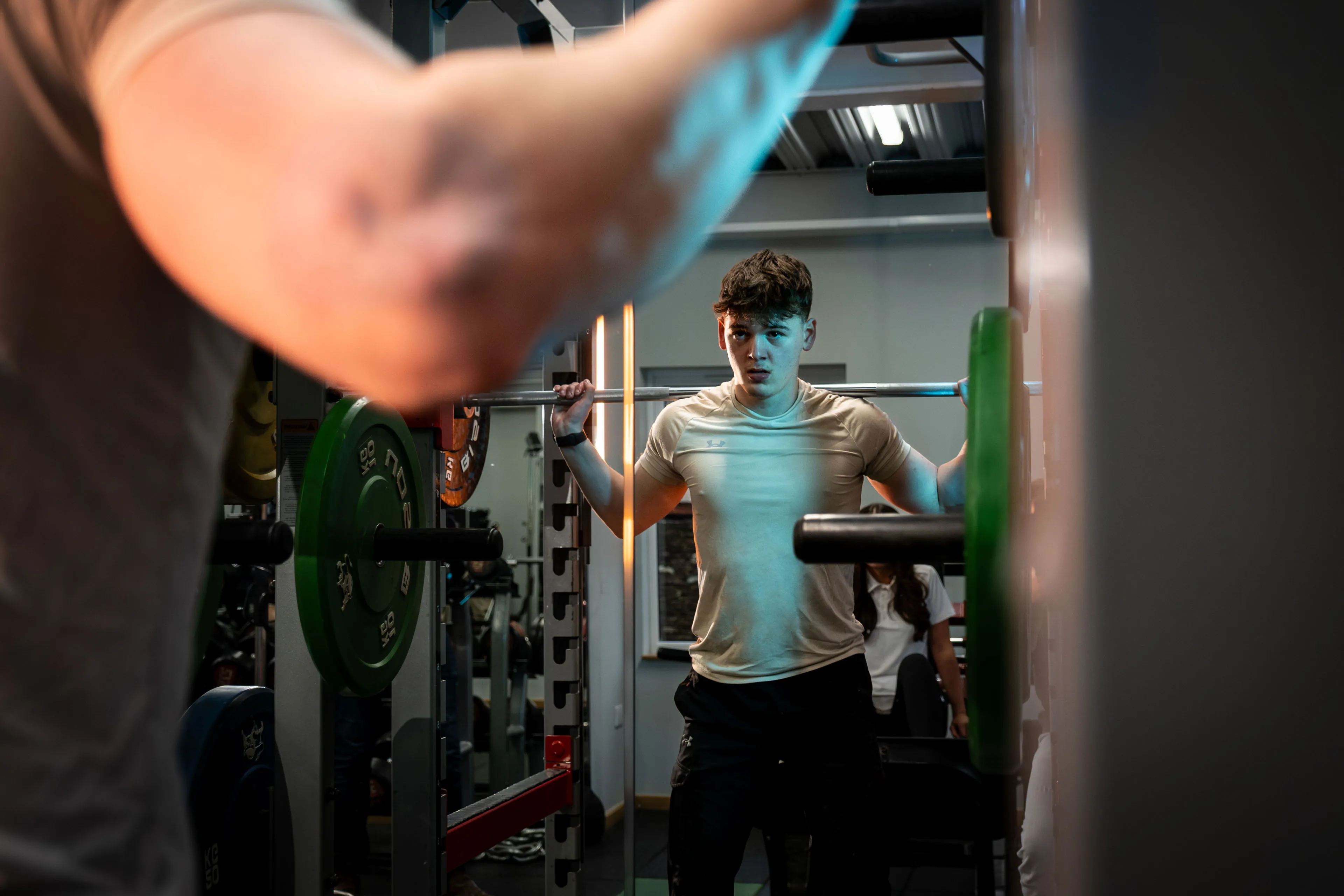
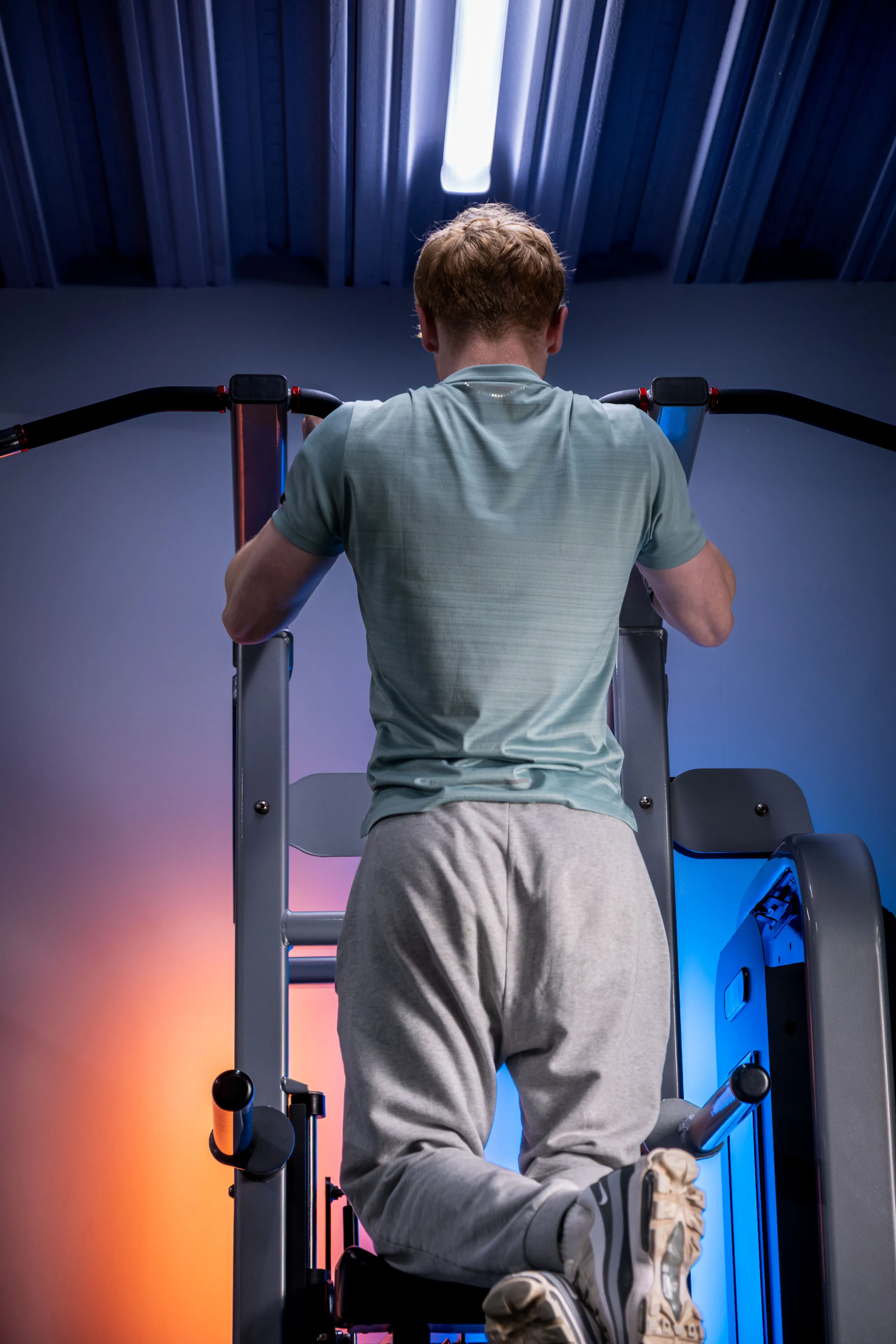
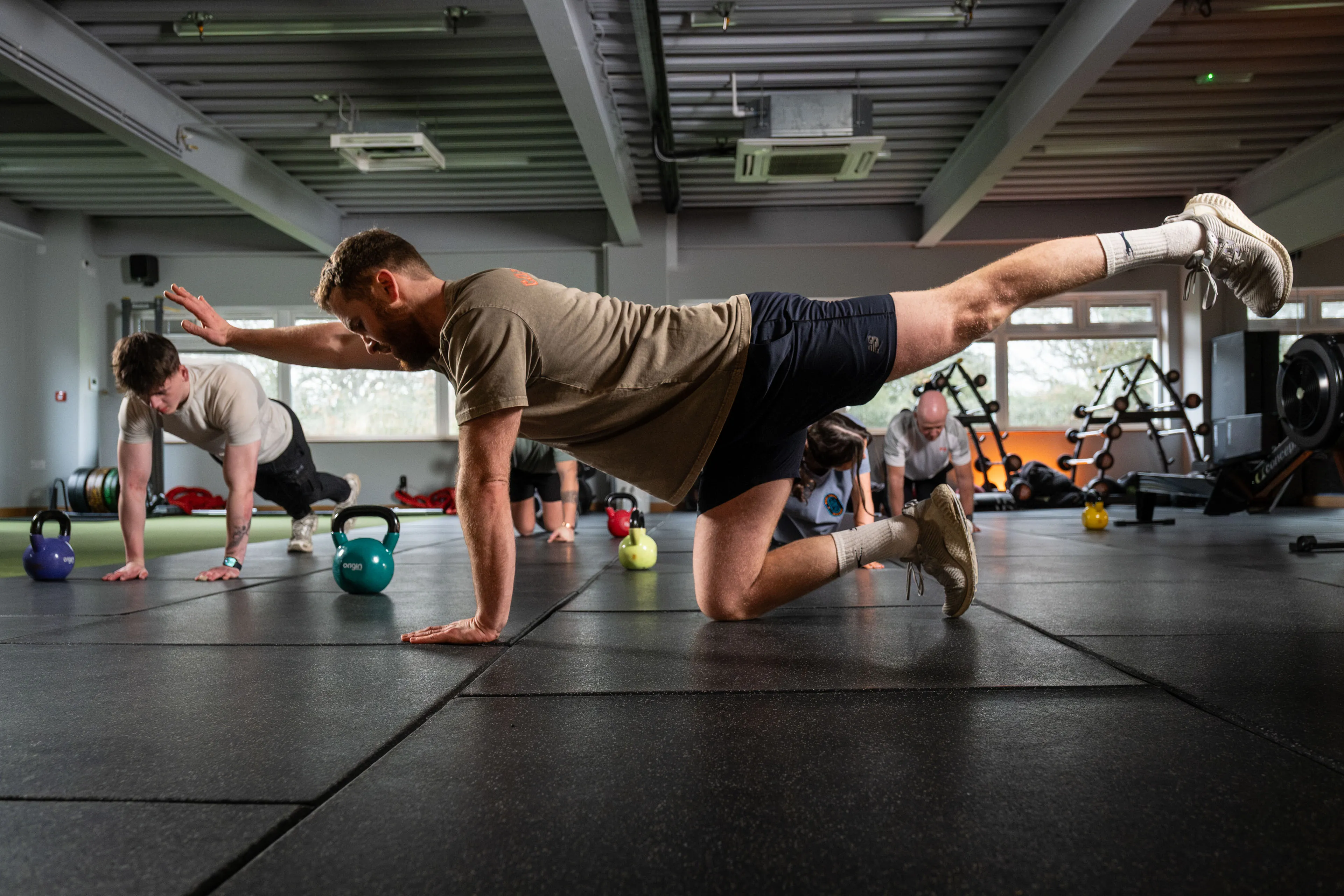
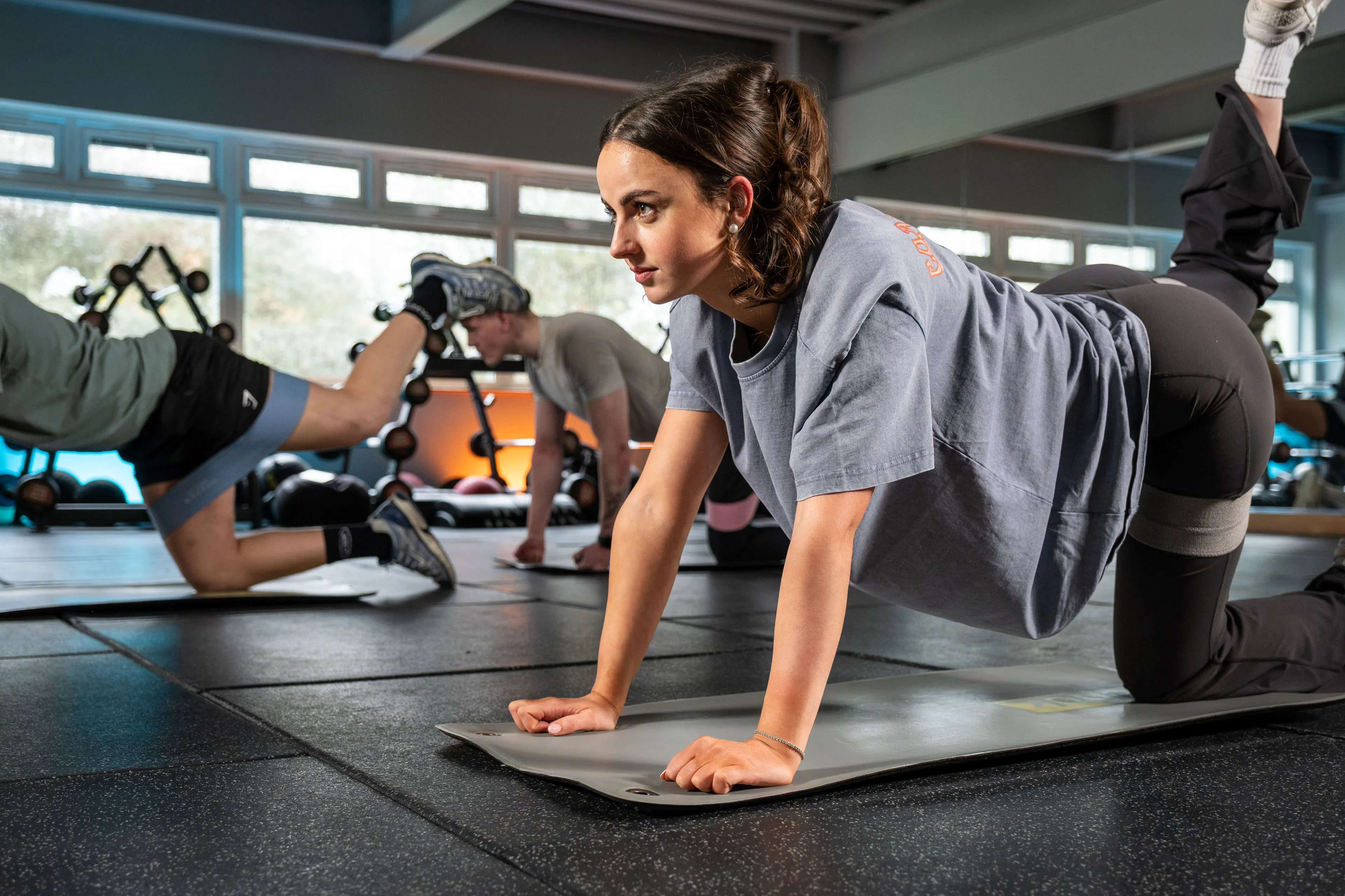
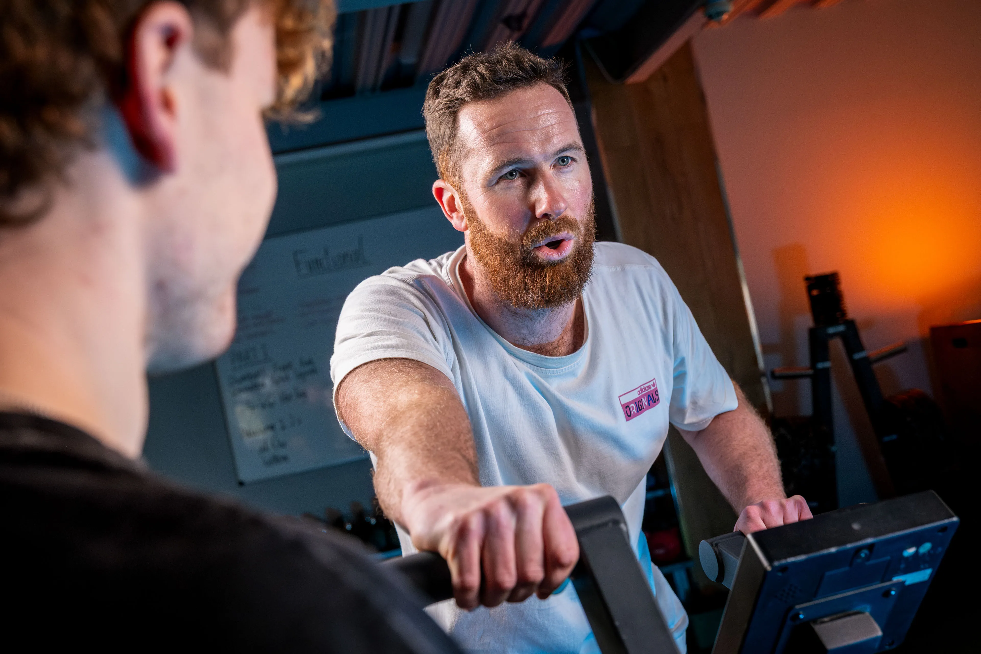
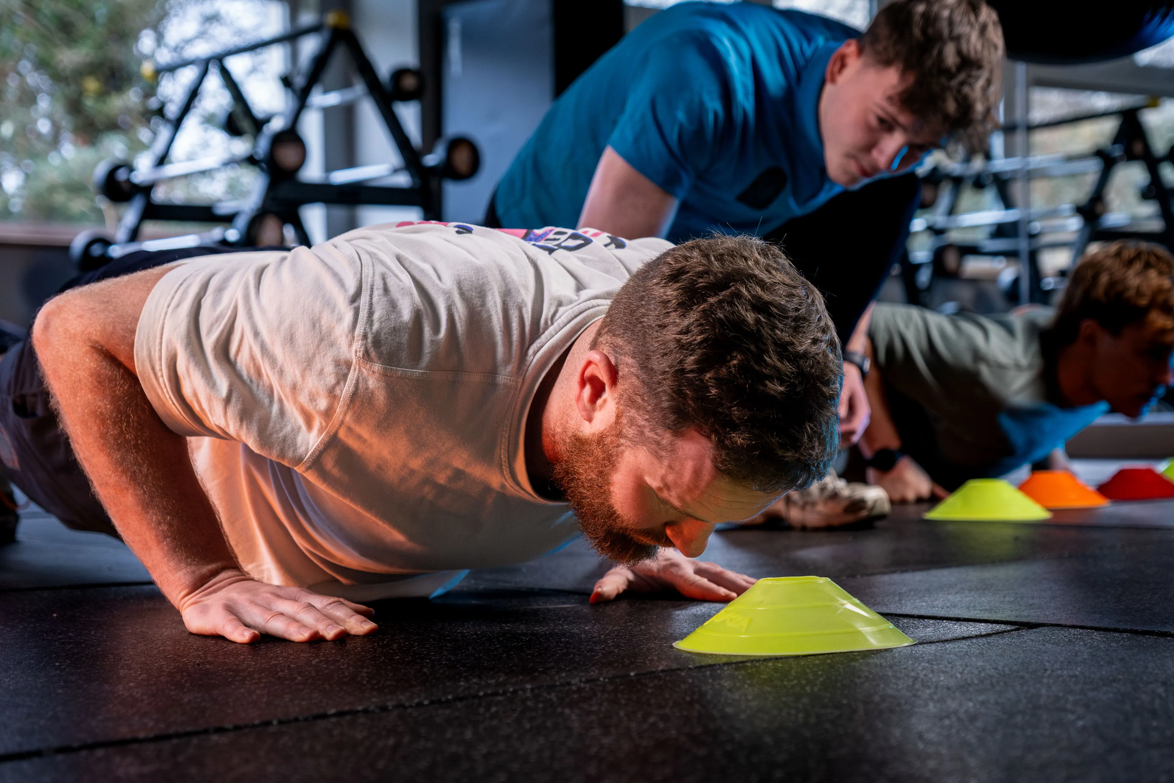
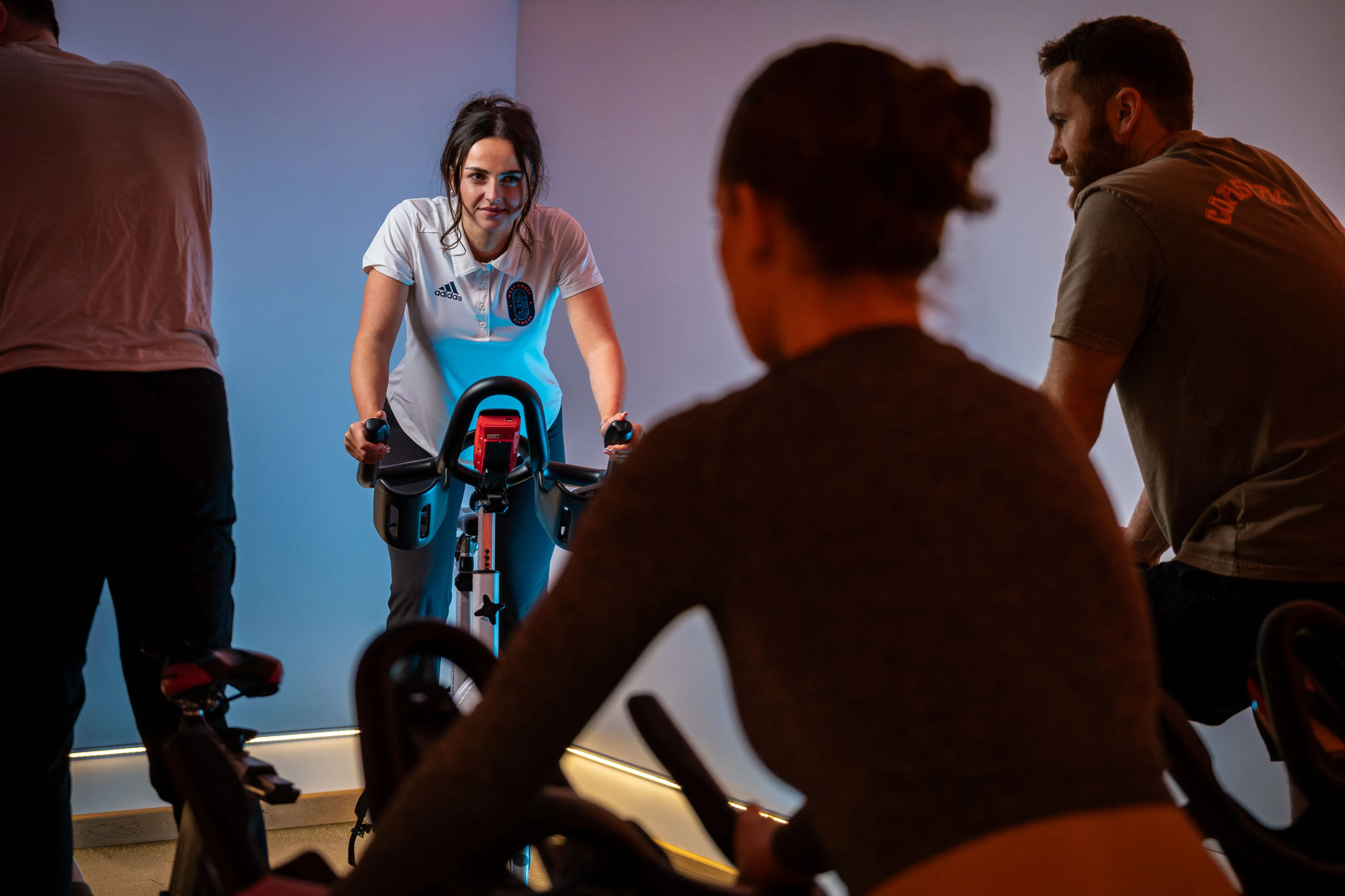
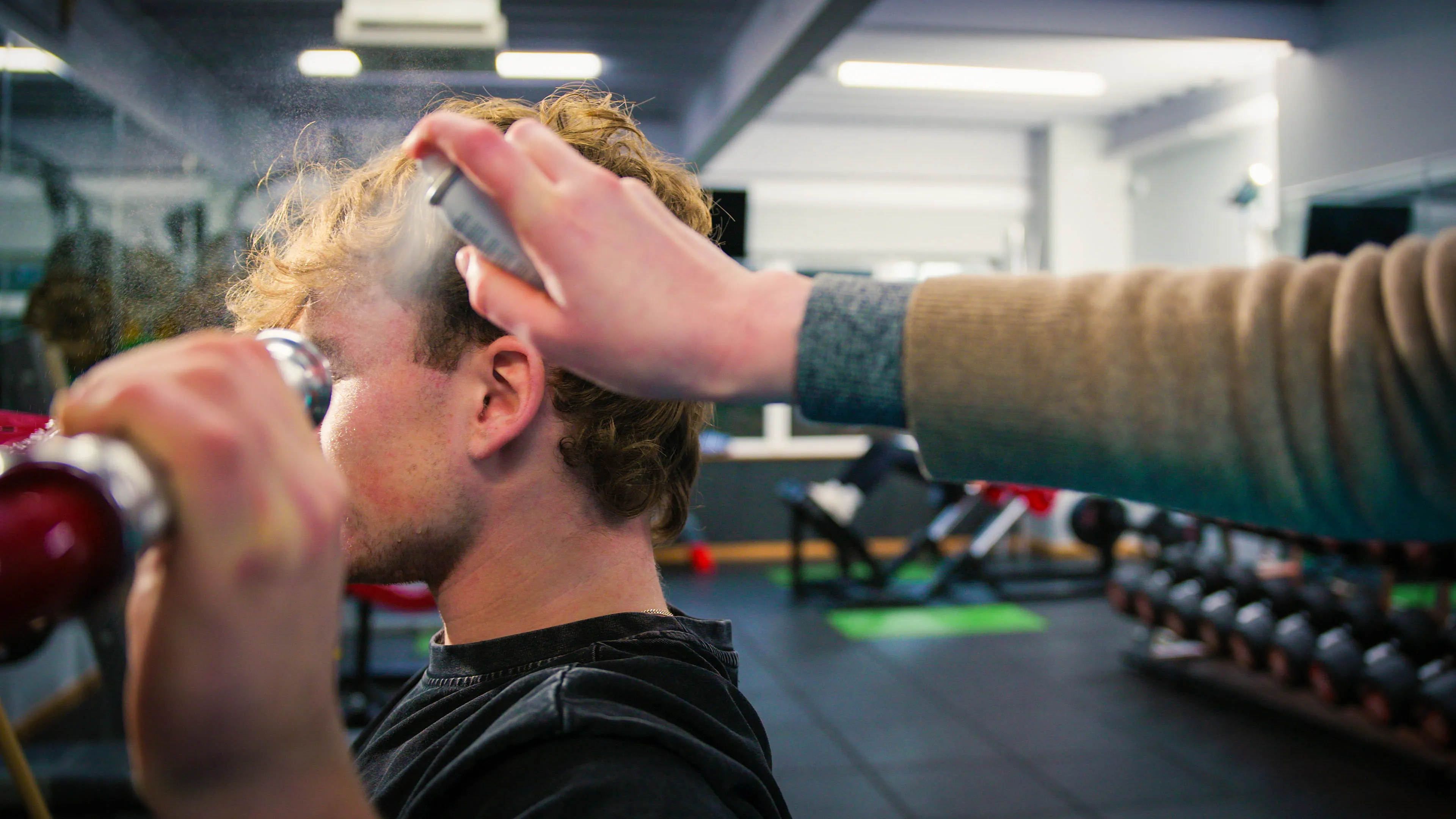
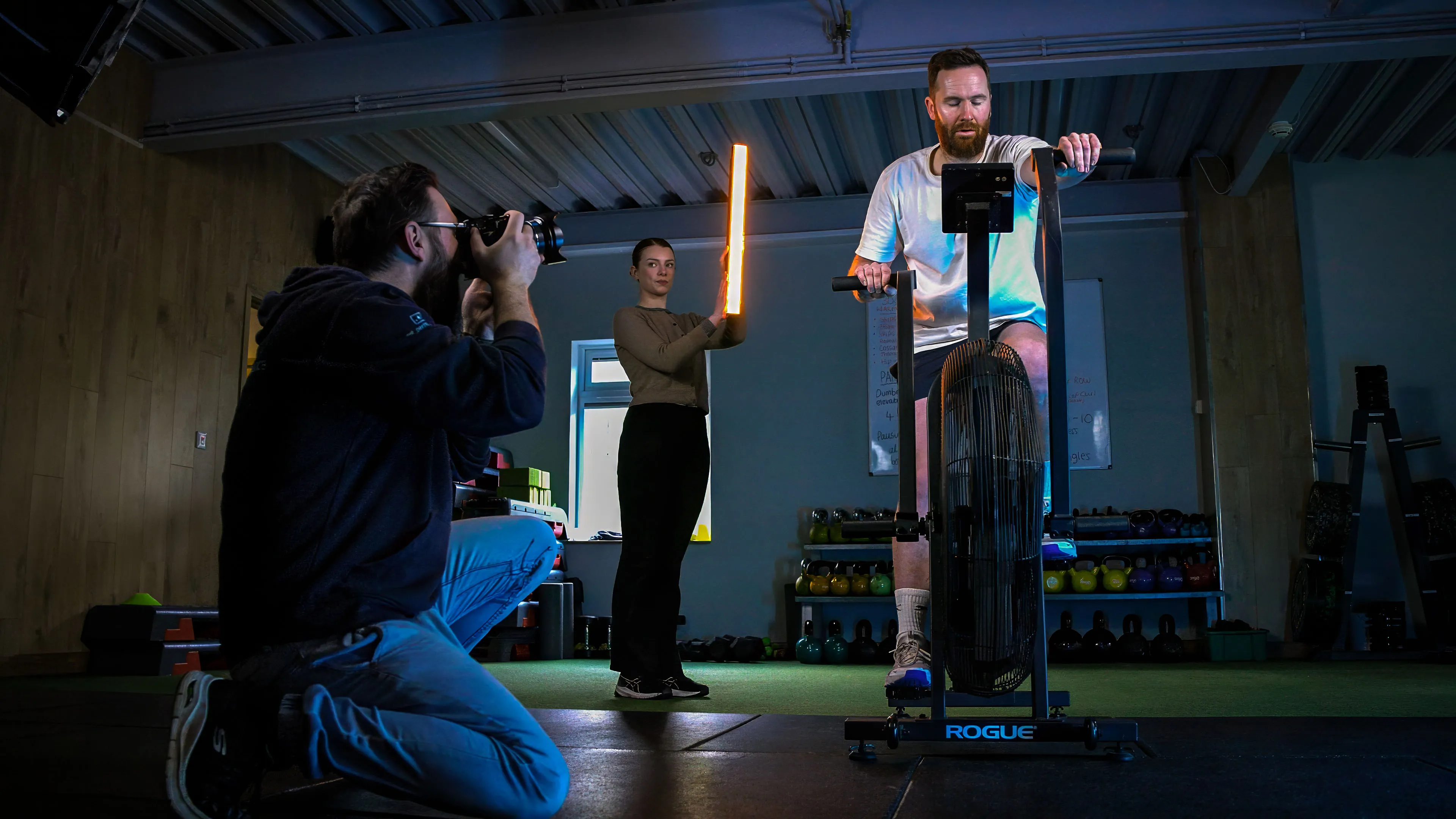
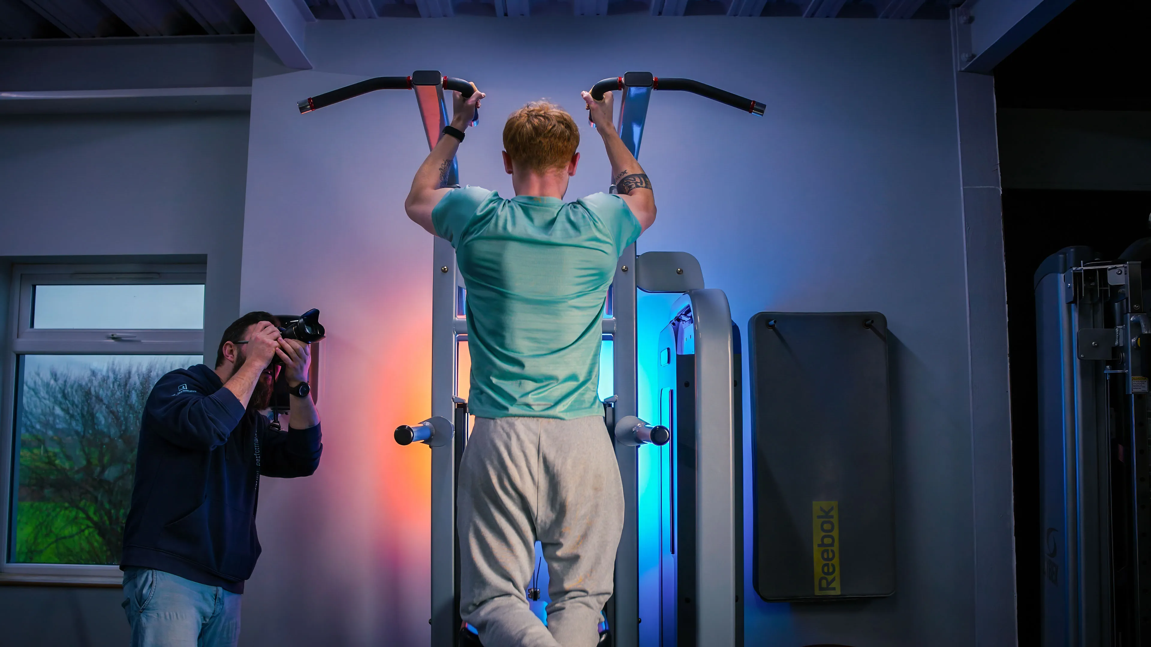
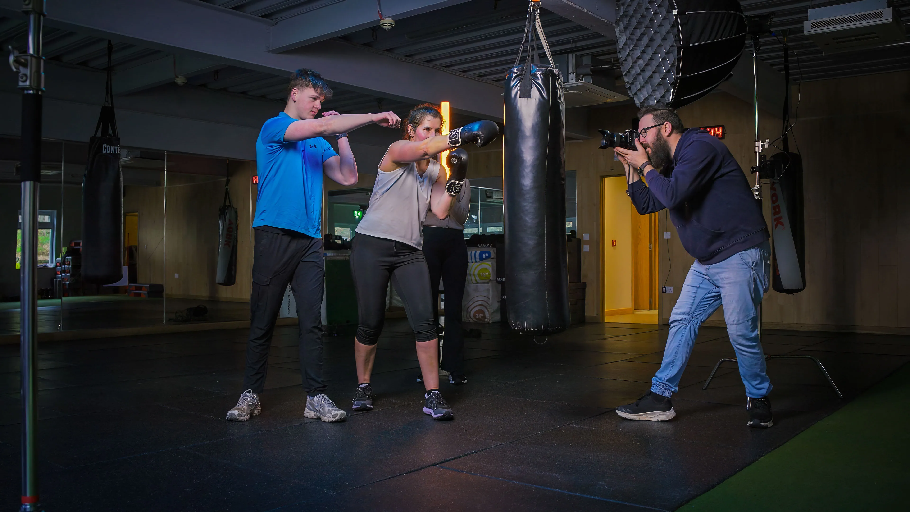
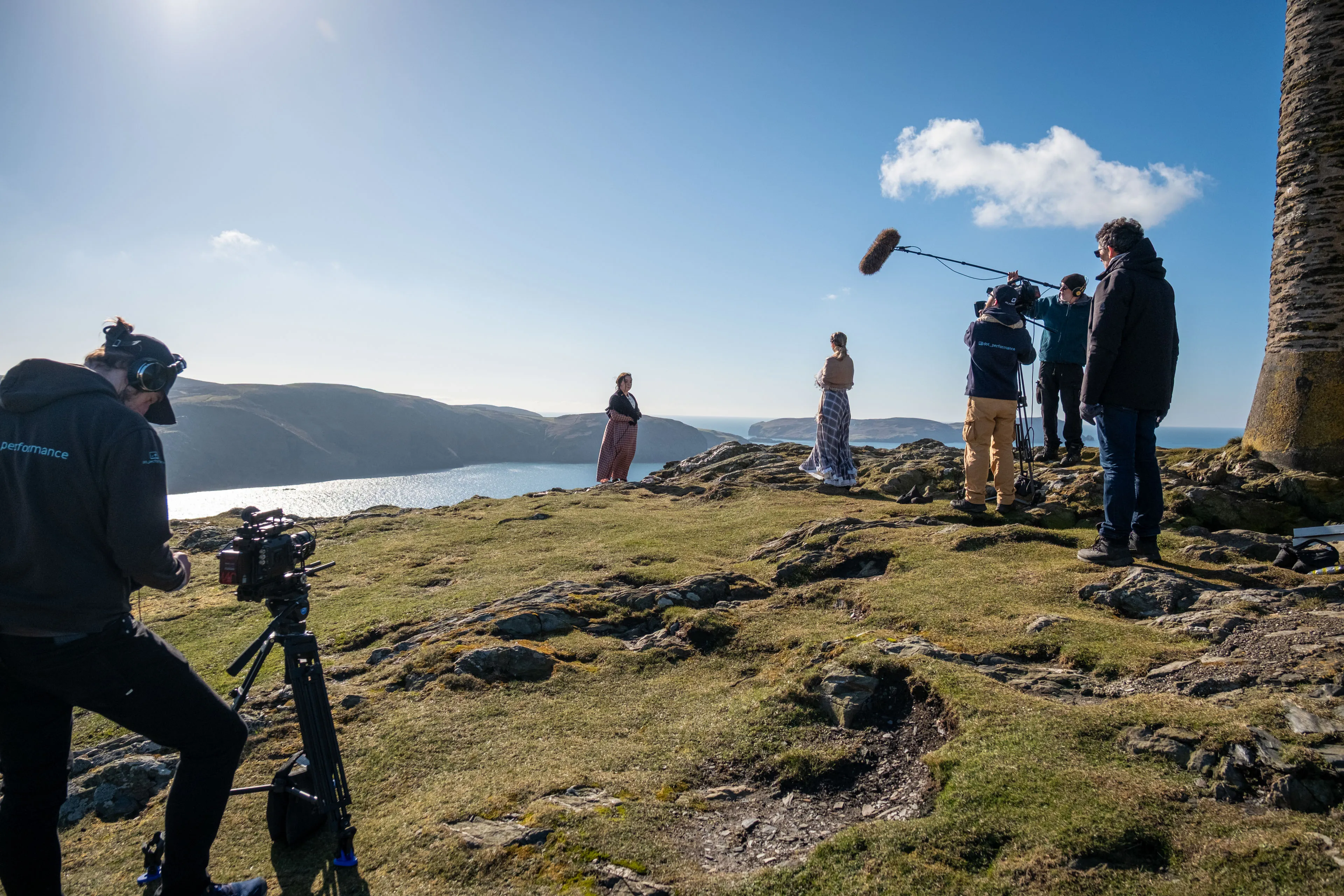
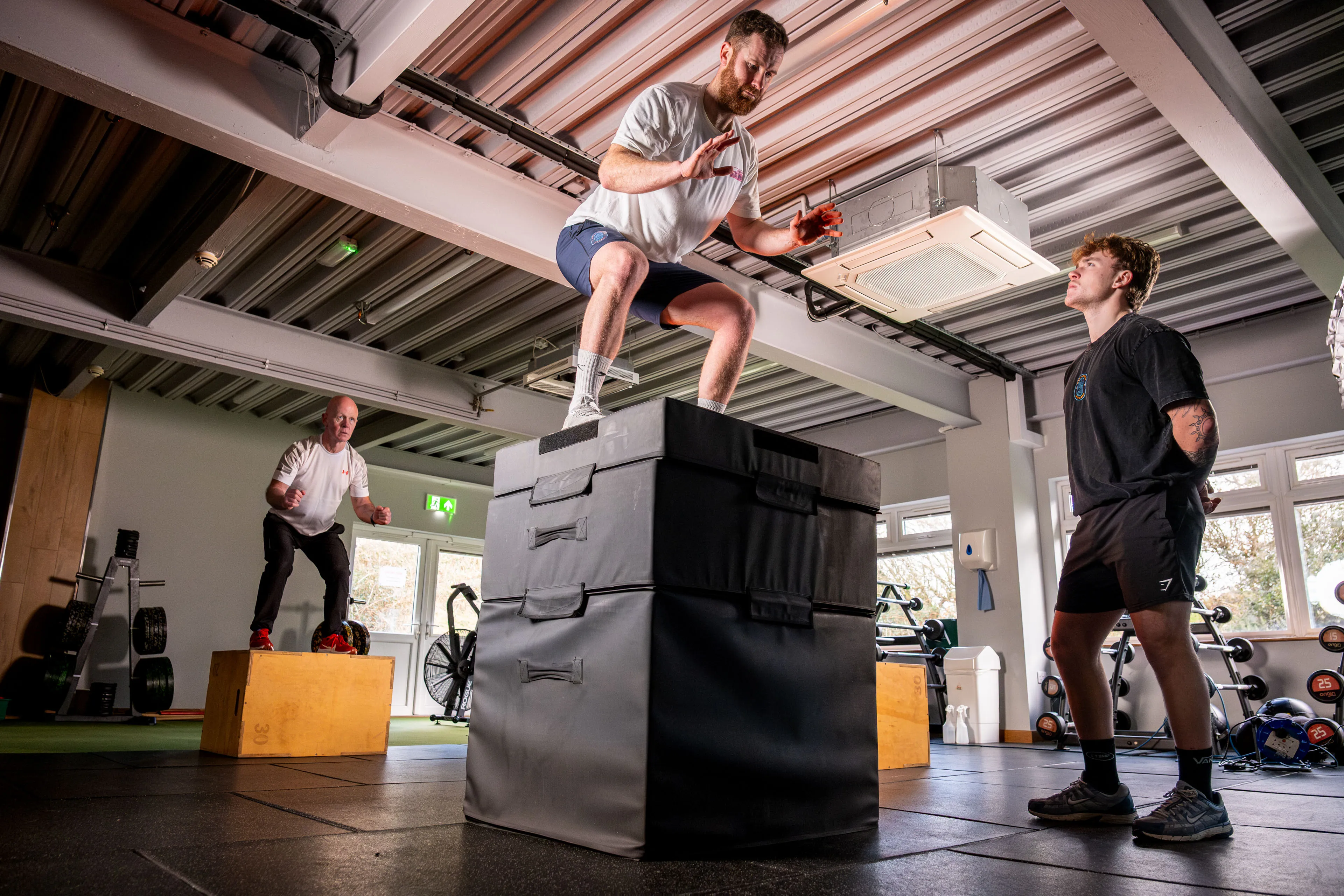
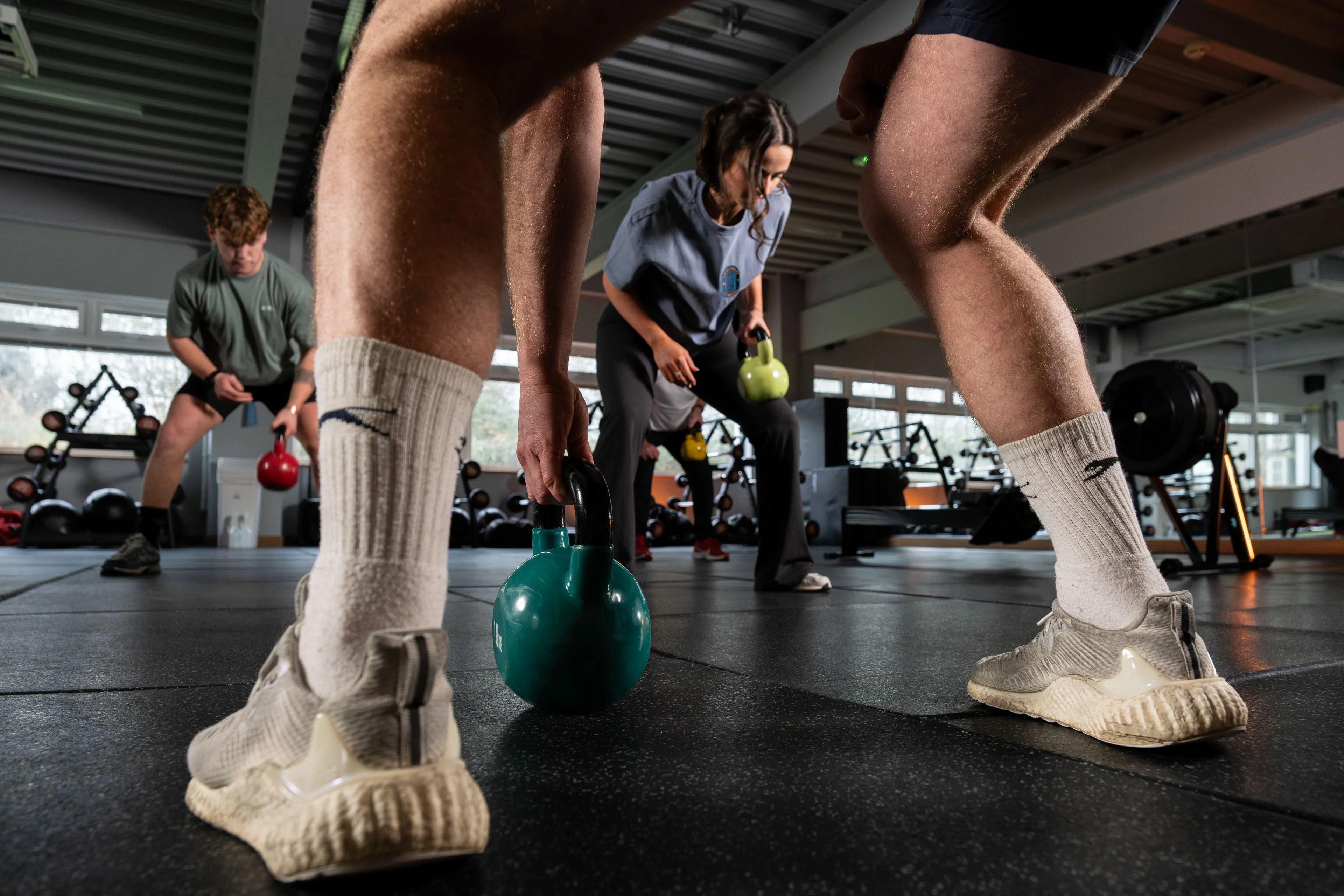
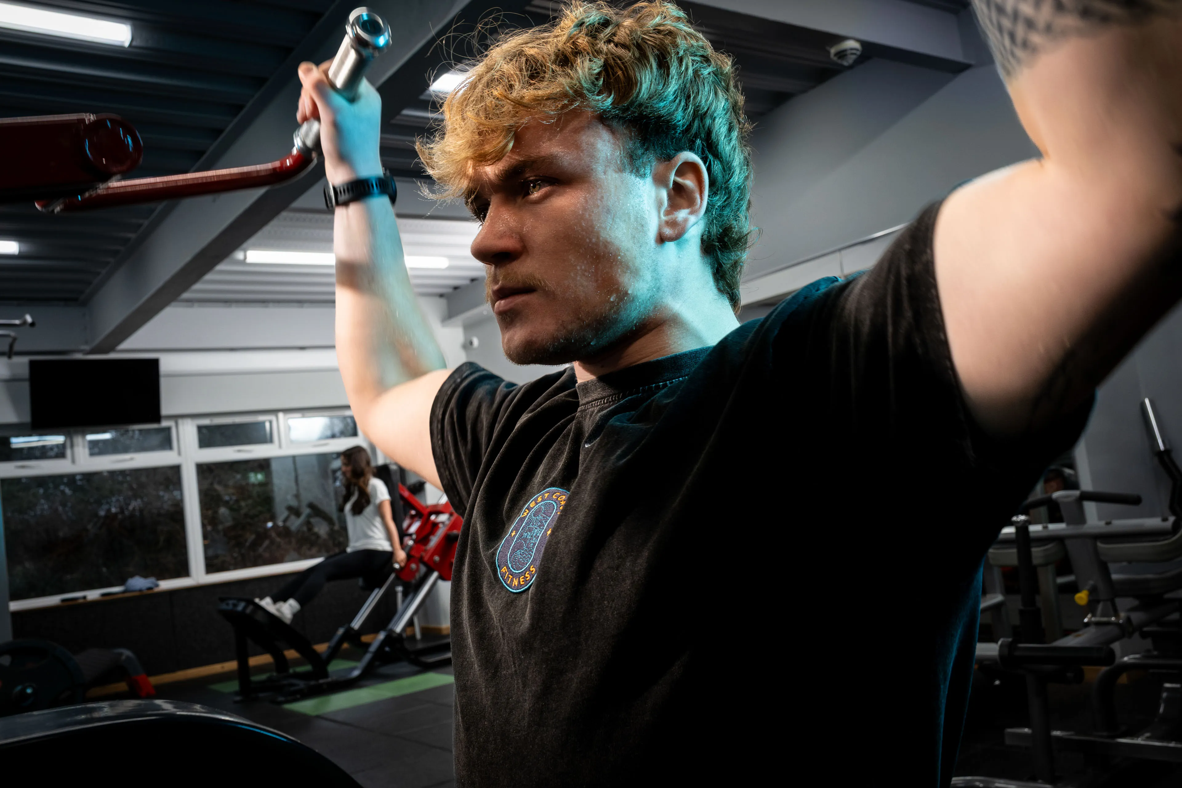
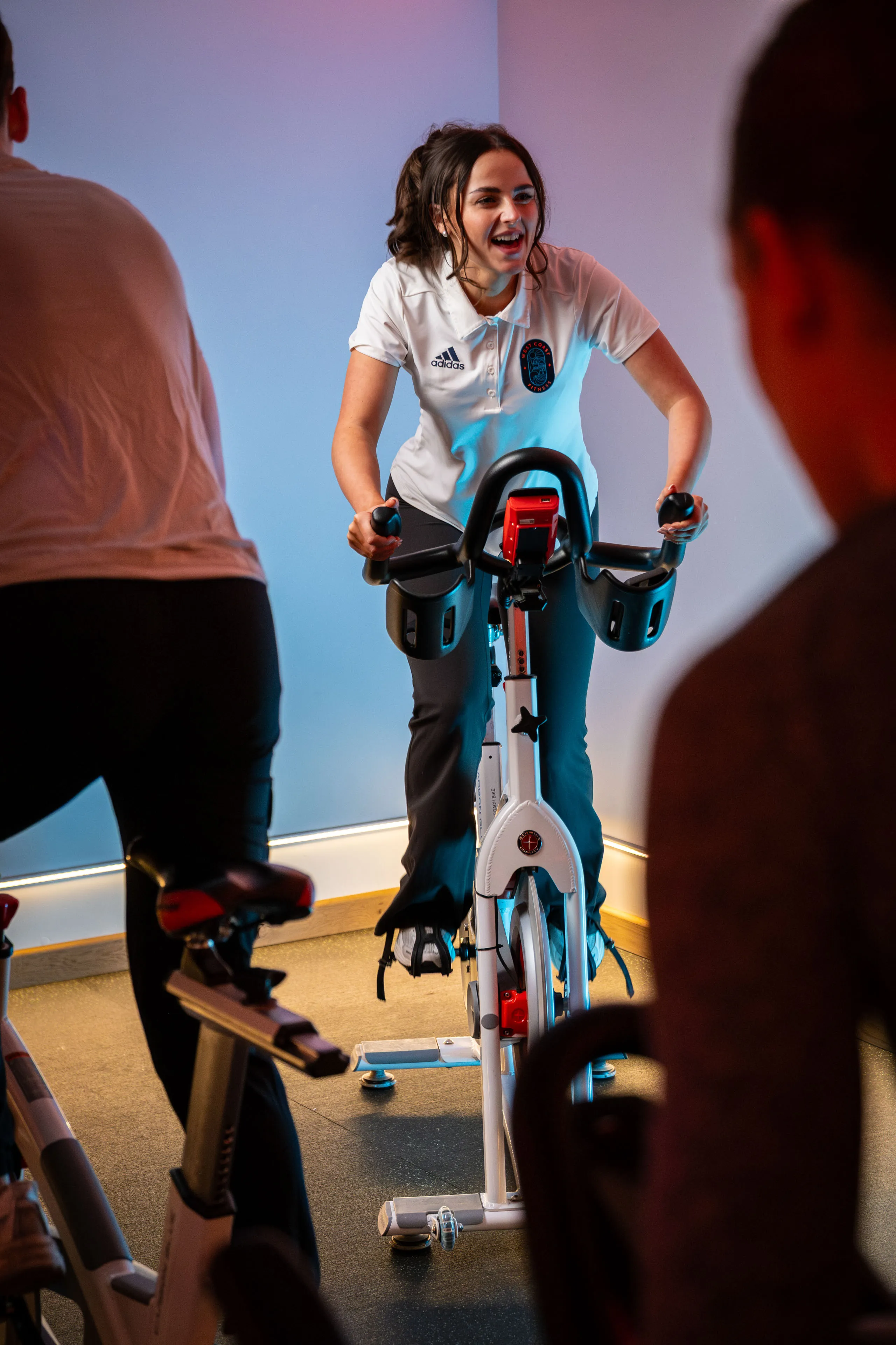
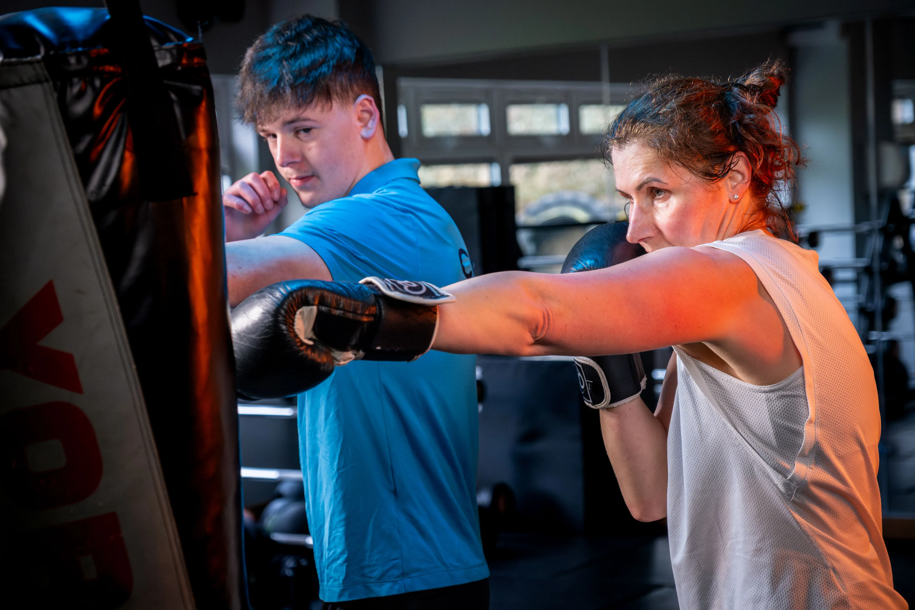
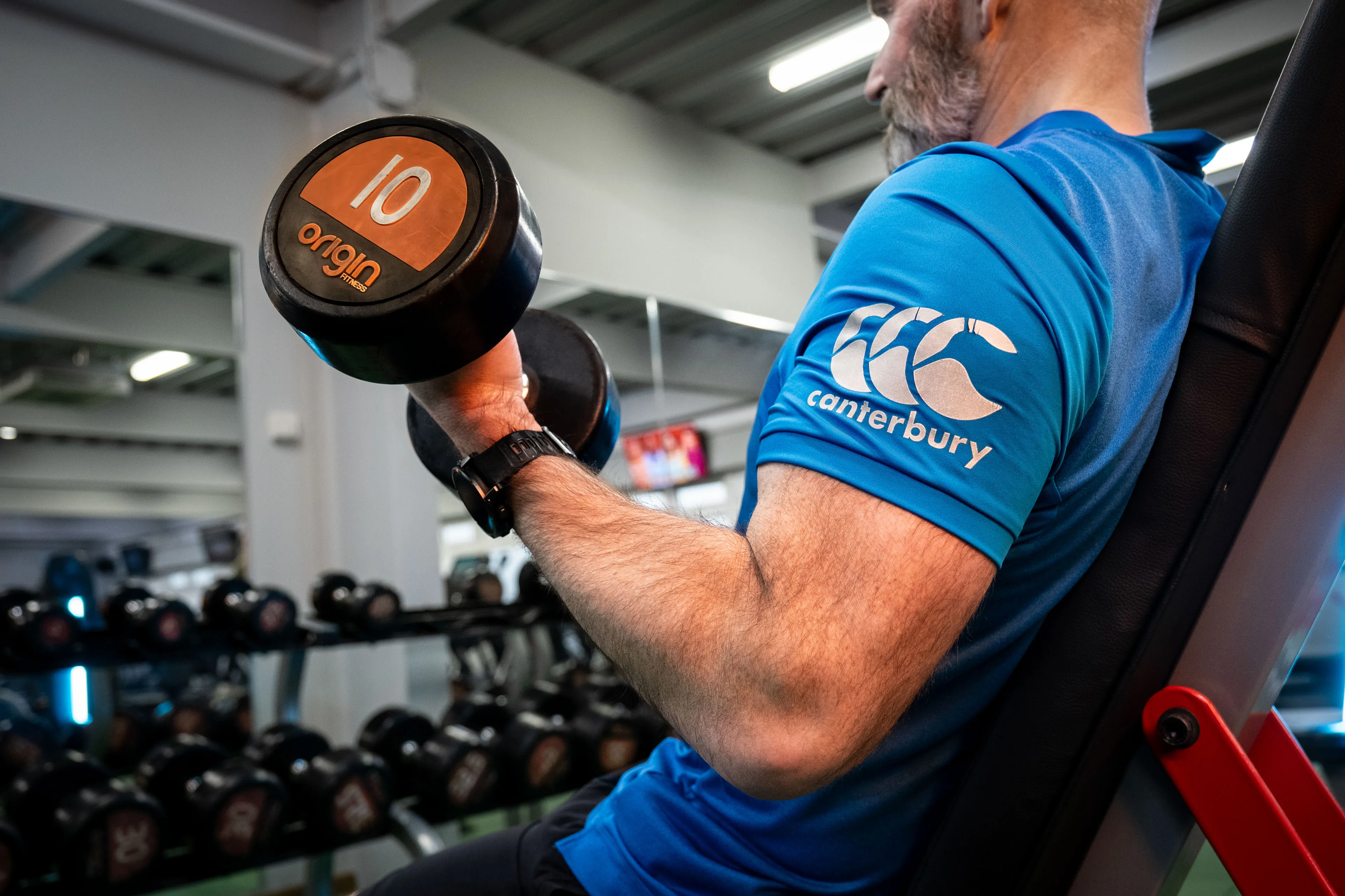
This project started with the shoot. We photographed live sessions as they happened, capturing coaches and members in the middle of the work rather than stopping to manufacture it. That gave the image set something better than performance. It gave it truth.
From there, the photography became the foundation for a wider visual system. Lighting, tone, colour and composition were all handled deliberately so the images could work together across the brand, website and digital touchpoints. The aim was consistency with character — a set of photographs that felt unmistakably West Coast Fitness every time they appeared.
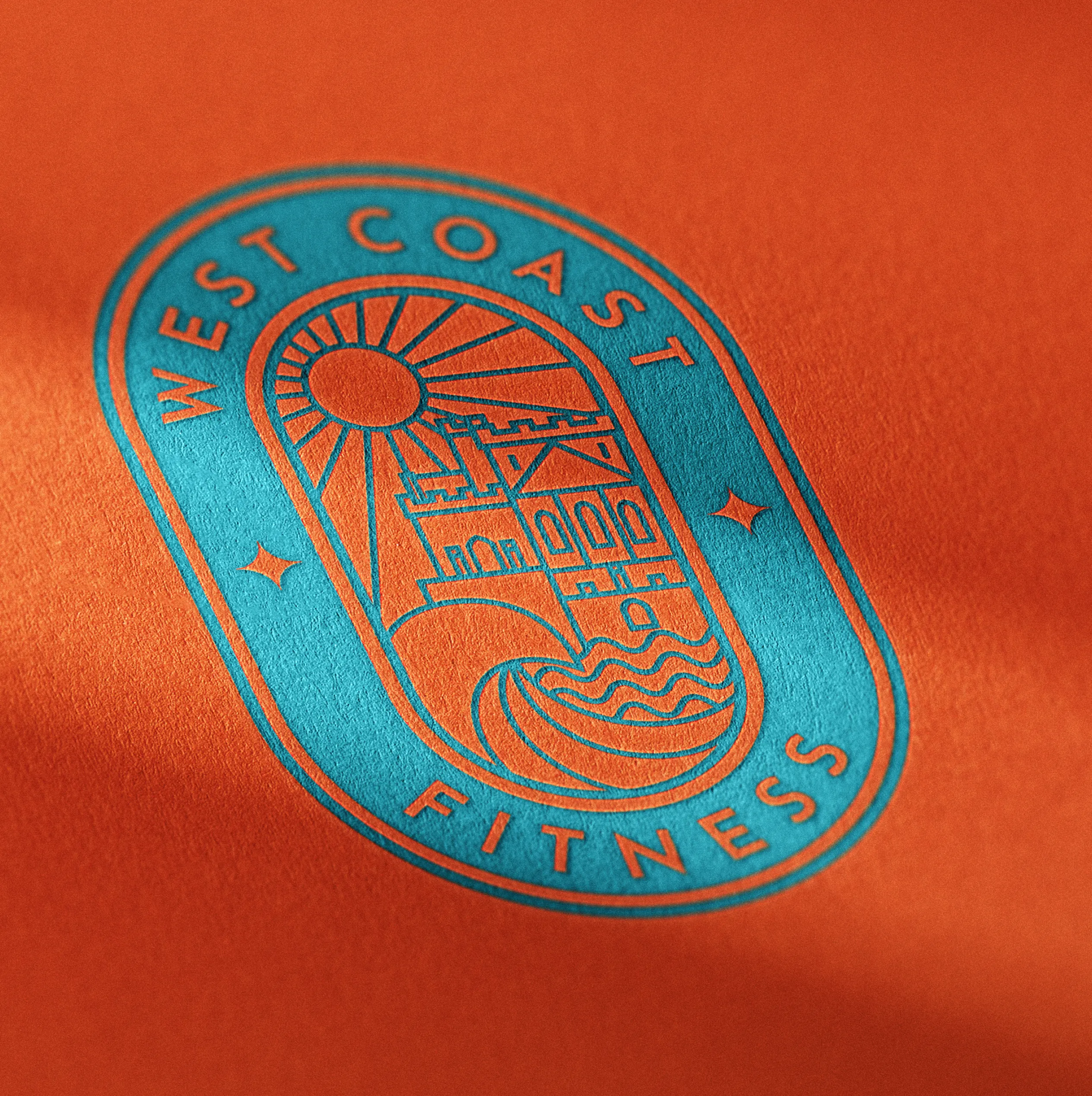
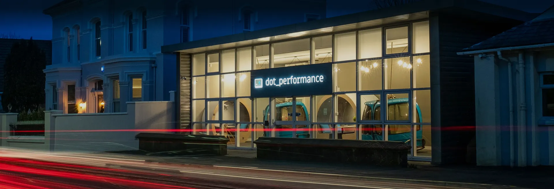
Alongside the shoot, we rebuilt the visual identity to carry the same qualities as the gym itself: focused, high-energy and confident without becoming noisy. The new system gave the brand a clearer structure and a stronger presence, while the photography gave it something real to stand on.
The result was a brand, image library and digital presence that finally matched the standard of the place itself. West Coast Fitness had always punched above its weight. Now the visual system does too.
Our role: Brand strategy, visual identity, photography and digital.