Hero background
West Coast Fitness

Replacing a fragmented identity with a brand worthy of the gym behind it.

Read more
Multiple floating device mockups including tablets and smartphones displaying the Peel's Community Fitness Centre website with dark navy and teal branding, fitness photography and classes pages on a teal background

Someone in Peel is looking for a local gym. Close to home, no long drive. They search, find West Coast Fitness, and within a few clicks they get a sense of exactly what it is - a serious gym, a real community, and a location that uses the island's coastline rather than ignoring it.

That clarity doesn't happen by accident.

West Coast Fitness logo on navy, designed by DotPerformance as part of the brand identity for the Peel fitness centre on the Isle of Man
West Coast Fitness logo on orange showing the badge variant, designed by DotPerformance for the Peel community fitness centre
West Coast Fitness logo on teal, designed by DotPerformance for the Isle of Man fitness centre
Still from a West Coast Fitness brand video produced by DotPerformance, showing a motion graphic passing across the frame with light trails and movement blur

What West Coast Fitness needed

West Coast Fitness is the Isle of Man's premier gym. State-of-the-art facilities, a genuine community, and a setting that earns its coastal identity. The reputation was solid. The membership was growing. What the team wanted was a brand that could carry all of that - consistently, across every channel and touchpoint - so that the first impression matched the experience of actually being there.

The quality, the community, the coast. Those three things were already true. The work was building a visual system strong enough to hold them together and take them everywhere.

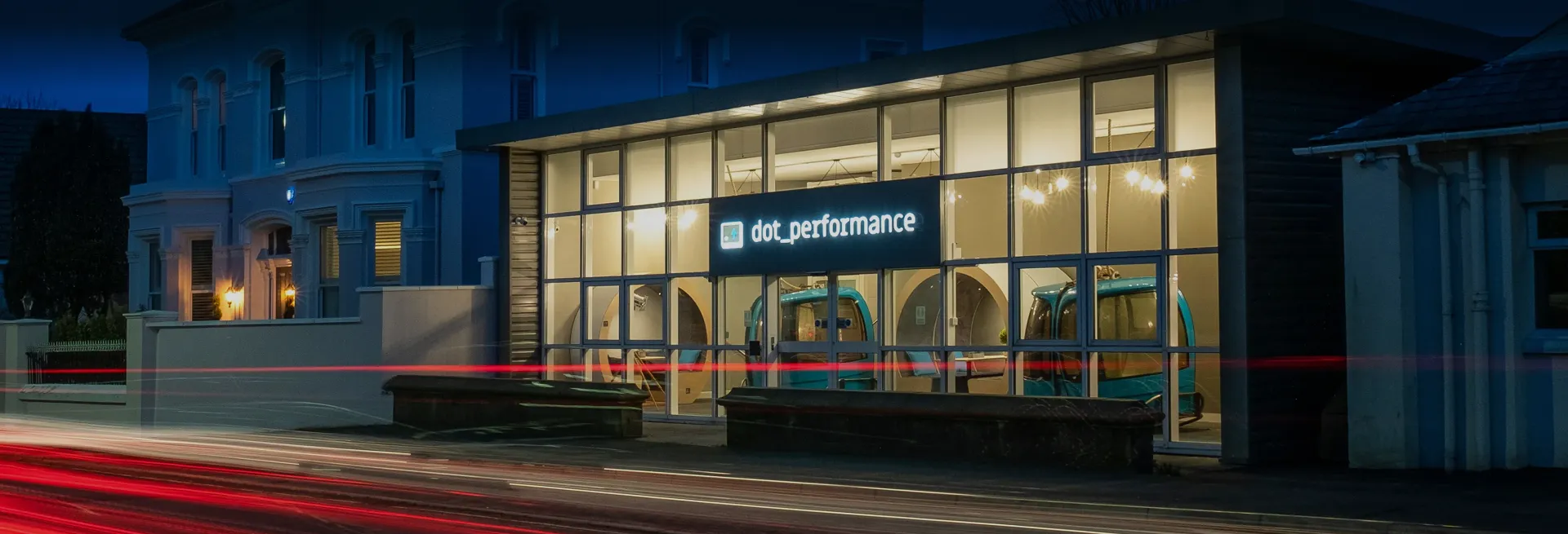
Build from what's already there

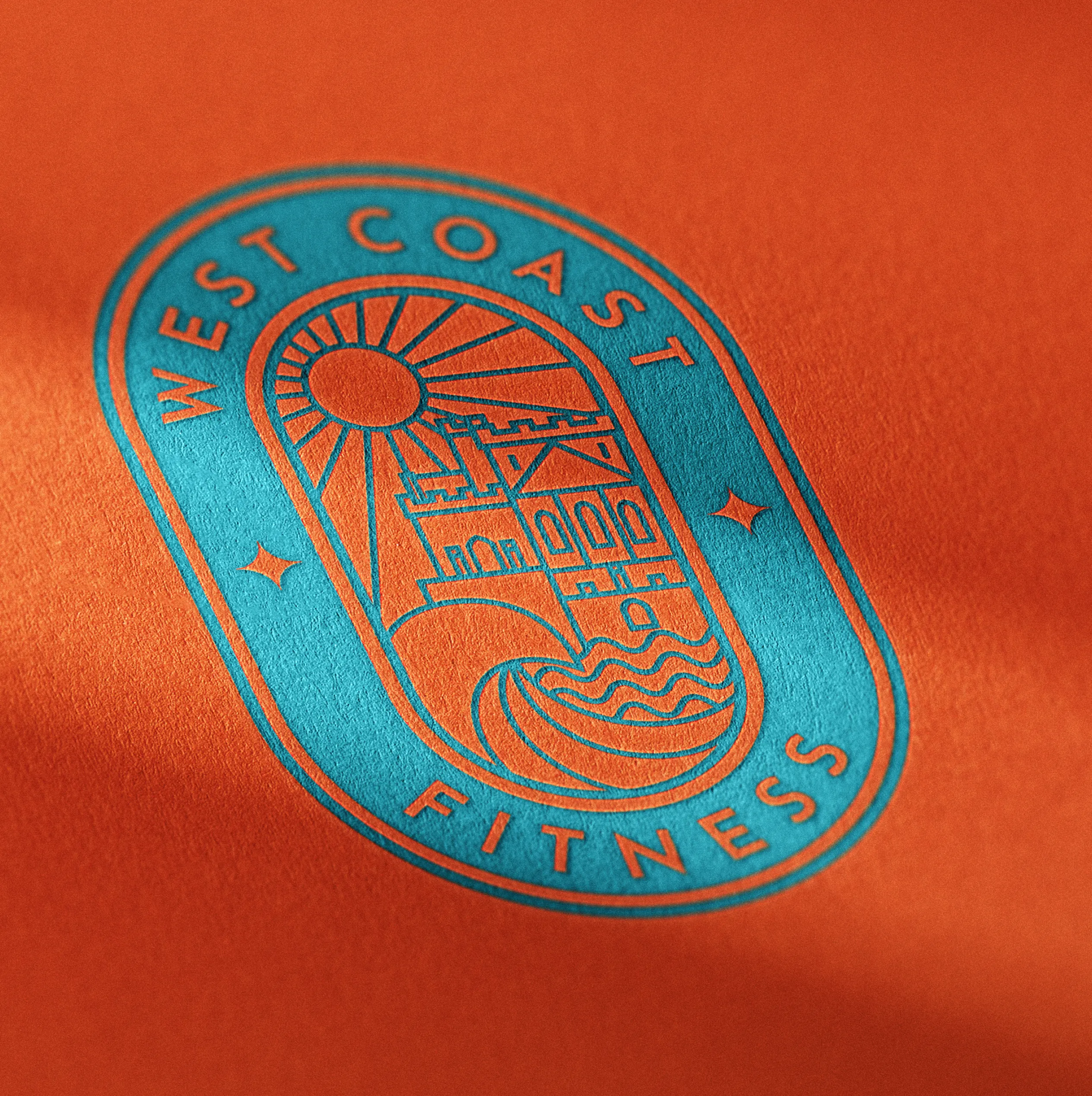
A single, resolved mark built to last. Bold enough to work on a gym bag or an outdoor banner. Peel is known across the island as sunset city, and that light and that coastline are in the brand's bones. The coastal reference earned by location, not borrowed for effect.

Deep navy and teal for the sea. Orange for the sunsets Peel is known for. Colours drawn directly from the place the gym sits in, not picked from a fitness industry palette. Strong enough to stand out in a digital feed. Cohesive enough that every application - from a T-shirt to a website header - reads as the same place.

Built to reflect the gym people actually walk into. Clear, fast, and direct. Classes, memberships, and facilities presented without friction. A tone that matches the community feel of the gym rather than the language of a sales funnel.

The identity extended across merchandise and wearables, so members carry the brand out of the building. Kit that people wear because it looks good, not because they were given it.

A brand system is only as strong as the imagery it runs on. We shot a full library of photos and a promotional reel on location at the gym. Instructors and members in action, energy captured rather than staged. Dynamic enough to stop a scroll, authentic enough to reflect the community that actually trains there. The assets now sit across the website, social channels, and the gym's own media library, ready to use without reaching for stock.

  • West Coast Fitness class schedule displayed on a tablet, designed and developed by DotPerformance for the Peel community fitness centre on the Isle of Man
  • West Coast Fitness website pages showing the homepage, classes, spin and location sections designed and developed by DotPerformance for the Peel community fitness centre
  • Full spread of West Coast Fitness website pages designed and developed by DotPerformance, including homepage, classes, spin, memberships and FAQs for the Peel community fitness centre
  • West Coast Fitness branded navy t-shirt featuring the logo designed by DotPerformance for the Peel fitness centre on the Isle of Man
  • West Coast Fitness logo embossed on orange printed material, part of the brand identity designed by DotPerformance for the Isle of Man fitness centre
  • West Coast Fitness logo embroidered on dark branded workwear, designed by DotPerformance for the Peel community fitness centre on the Isle of Man
  • West Coast Fitness branded hoodie featuring the logo designed by DotPerformance for the Isle of Man fitness centre
  • West Coast Fitness branded cap and t-shirt featuring the logo designed by DotPerformance for the Peel fitness centre on the Isle of Man
  • A member doing push-ups at West Coast Fitness, Peel's community fitness centre on the Isle of Man, photographed for DotPerformance
  • A member using a weights machine at West Coast Fitness on the Isle of Man, photographed for DotPerformance
  • A West Coast Fitness instructor leading a spin class at the Peel community fitness centre on the Isle of Man, photographed for DotPerformance
  • A member training on a rowing machine at West Coast Fitness, photographed for DotPerformance
A West Coast Fitness trainer supervising a boxing bag session at the Peel gym on the Isle of Man, photographed for DotPerformance

What changed

West Coast Fitness now has one brand. Not a collection of assets that have to be explained or apologised for. A system that holds together online, in the building, and on everything in between.

The person who googles them now gets the same impression as someone who walks in. The quality, the community, the coast. All of it present before anyone picks up the phone or steps through the door.

Full spread of West Coast Fitness website pages designed and developed by DotPerformance, including homepage, classes, spin, memberships and FAQs for the Peel community fitness centre

The gym that looks like the gym

Most fitness brands default to the same visual language. Dark and aggressive, built to intimidate. Or pastel and aspirational, built to reassure. West Coast Fitness is neither. It's a serious gym with a community at its centre, on an island with a coastline worth referencing.

The brand works because it came from the place, not from a template. That's the difference between a brand that gets adopted and one that gets ignored.

When the outside matches the inside, people stop hesitating.

Andy Orton founder of DotPerformance, smiling wearing a DotPerformance branded polo shirt at DotPerformance studios on the Isle of Man, against a dark background with teal neon lighting

DotPerformance is an Isle of Man-based agency that works with founders to build brand identity, visual systems, and photography libraries for new and growing businesses. The agency handles brand strategy, photography, and digital from its studio in Douglas.

How we work with founders
SubscribeSUBSCRIBE