A buyer at a seafood distributor in Lyon is sourcing premium shellfish. She's comparing suppliers. One has a brand that looks like it belongs in a wholesale catalogue. One looks like it knows exactly what it is, where it comes from, and why that matters. The Isle of Man has a reputation for exceptional shellfish. Only one of those suppliers makes that reputation visible before she picks up the phone.
Island Seafare
Rebrand and digital platform for a family shellfish business targeting European markets.
Read more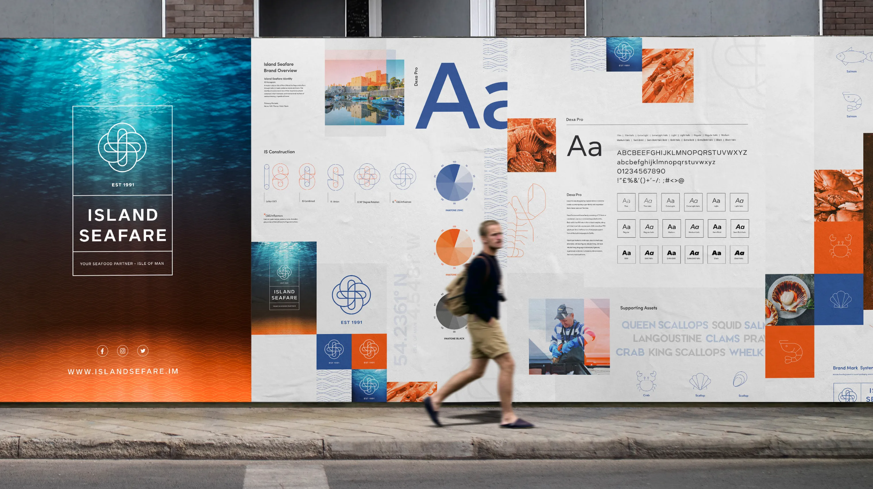
.webp)
.webp)
A business that had outgrown its image
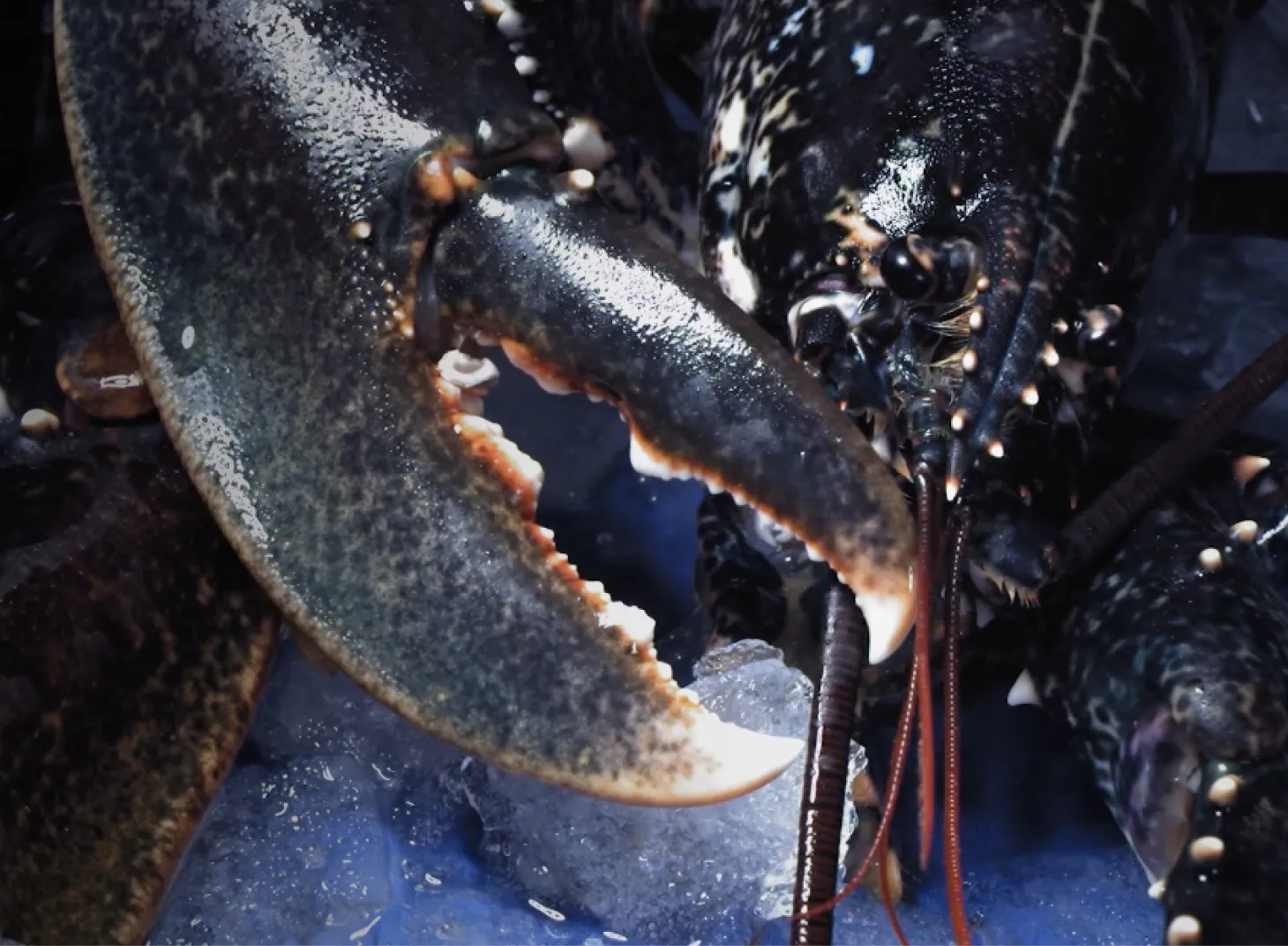
Island Seafare is a family-owned business on the Isle of Man, distributing high-quality shellfish to the UK and across Europe - France, Italy, Spain. The product has always been exceptional. The brand had reached the point most established businesses eventually reach: it reflected where the company had been, not where it was going.
For a business with genuine ambitions in the EU market, that gap wasn't cosmetic. In competitive international seafood trading, provenance and quality have to be communicated before a conversation begins. A brand that doesn't carry that weight loses ground before anyone has tasted the product.
.webp)
The rebrand
The brief was clear: reposition Island Seafare for key European markets without losing the identity and heritage that makes the product worth buying in the first place.
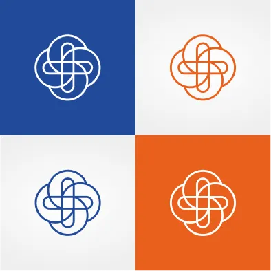
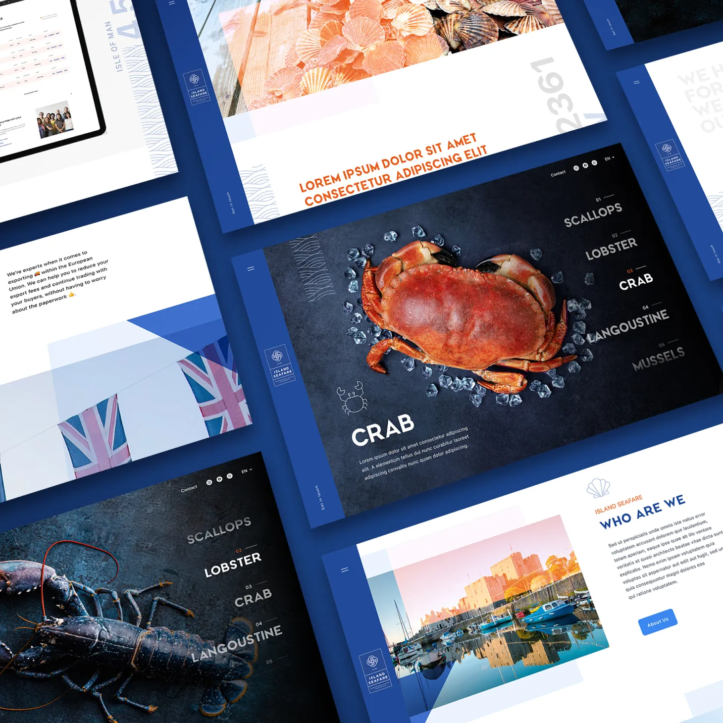
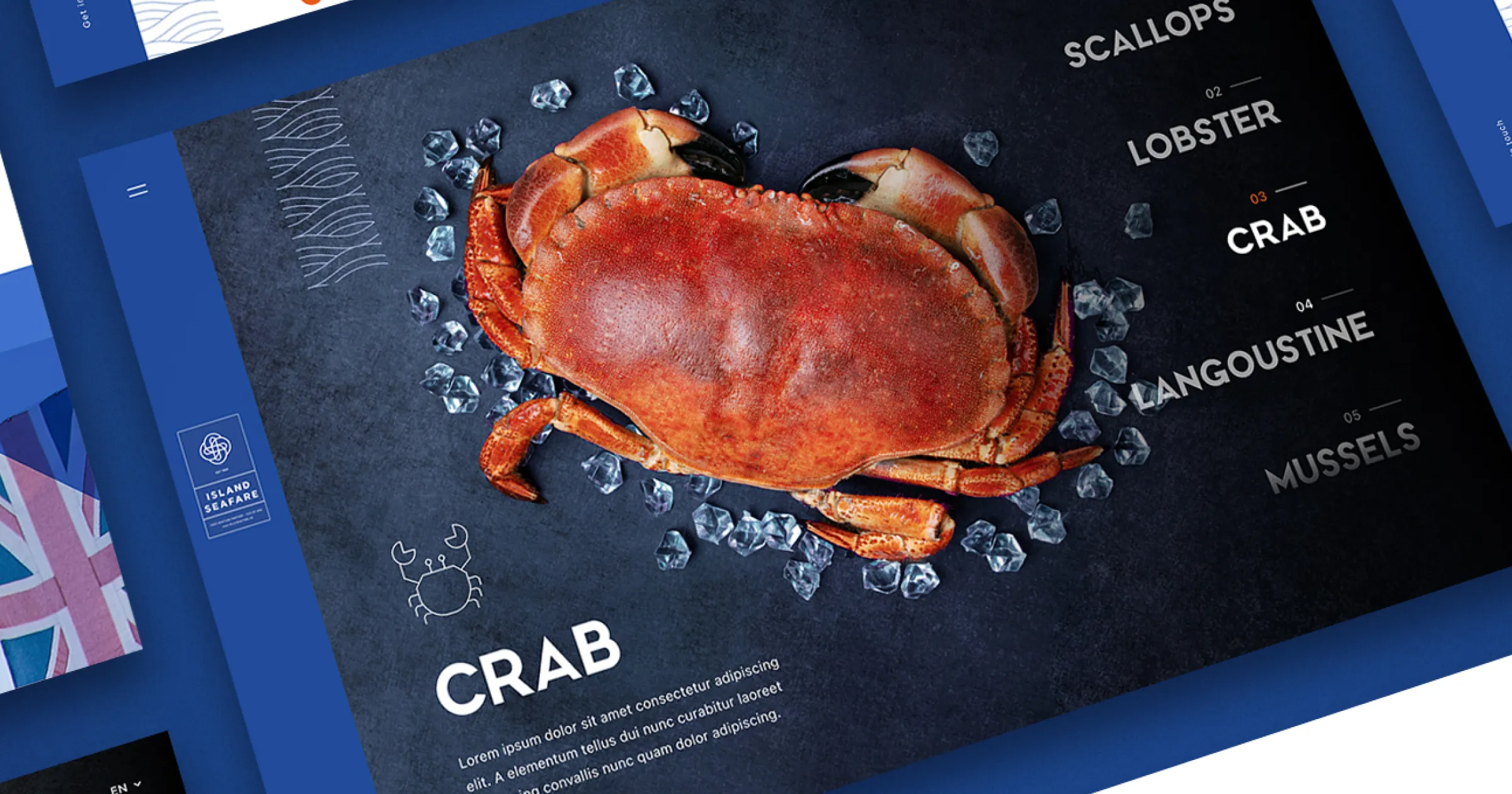
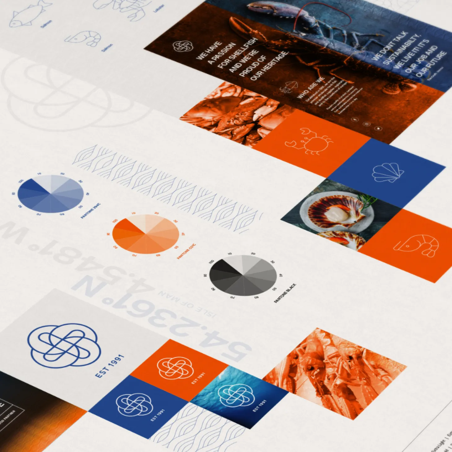
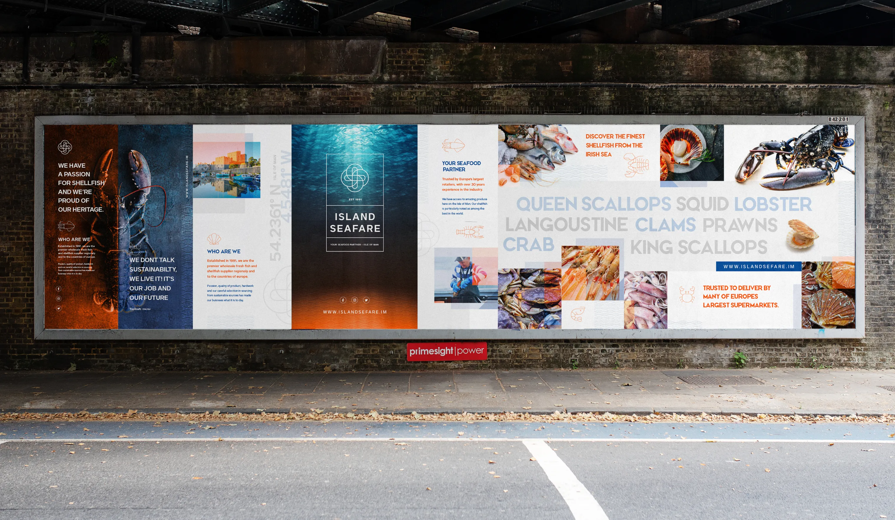
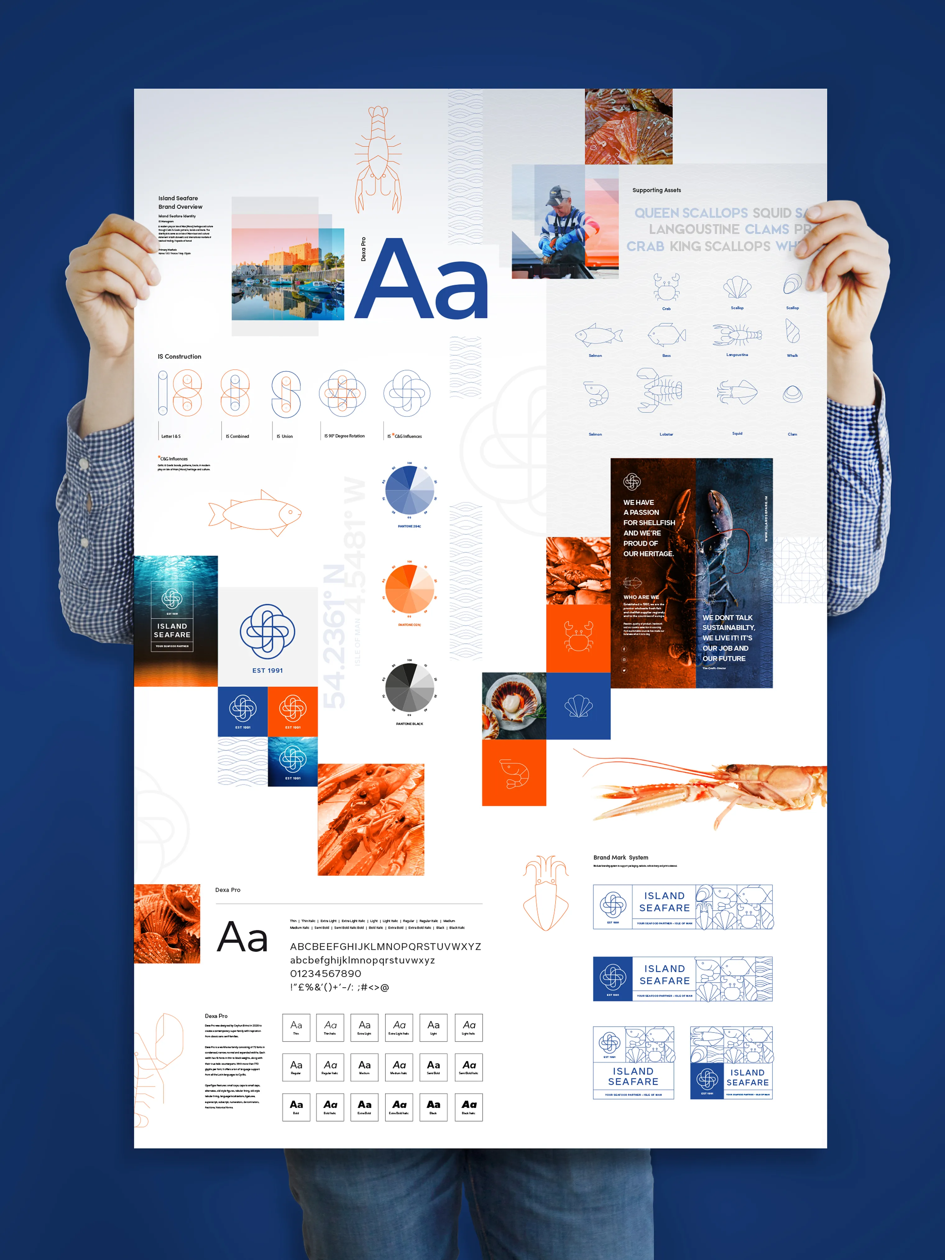
Brand identity and monogram The centrepiece of the rebrand is a monogram logo - a modern interpretation of the Isle of Man's Celtic and Gaelic heritage, built around the letters IS in a design that carries the island's distinct identity into every market it reaches. Not a logo that decorates a box. A mark that works as a provenance signal - on packaging, in trading materials, and across international markets - creating a direct association between the monogram and the Isle of Man's reputation for quality shellfish.
The design speaks to a local audience with a sense of belonging and to an international audience with a sense of origin. Both matter when the story of where something comes from is part of why it's worth buying.
Visual identity and iconography A complete visual system built for consistent application across domestic and international touchpoints. Iconography, colour, and typography drawn from the same source material - the island, its heritage, and the quality of what Island Seafare produces.
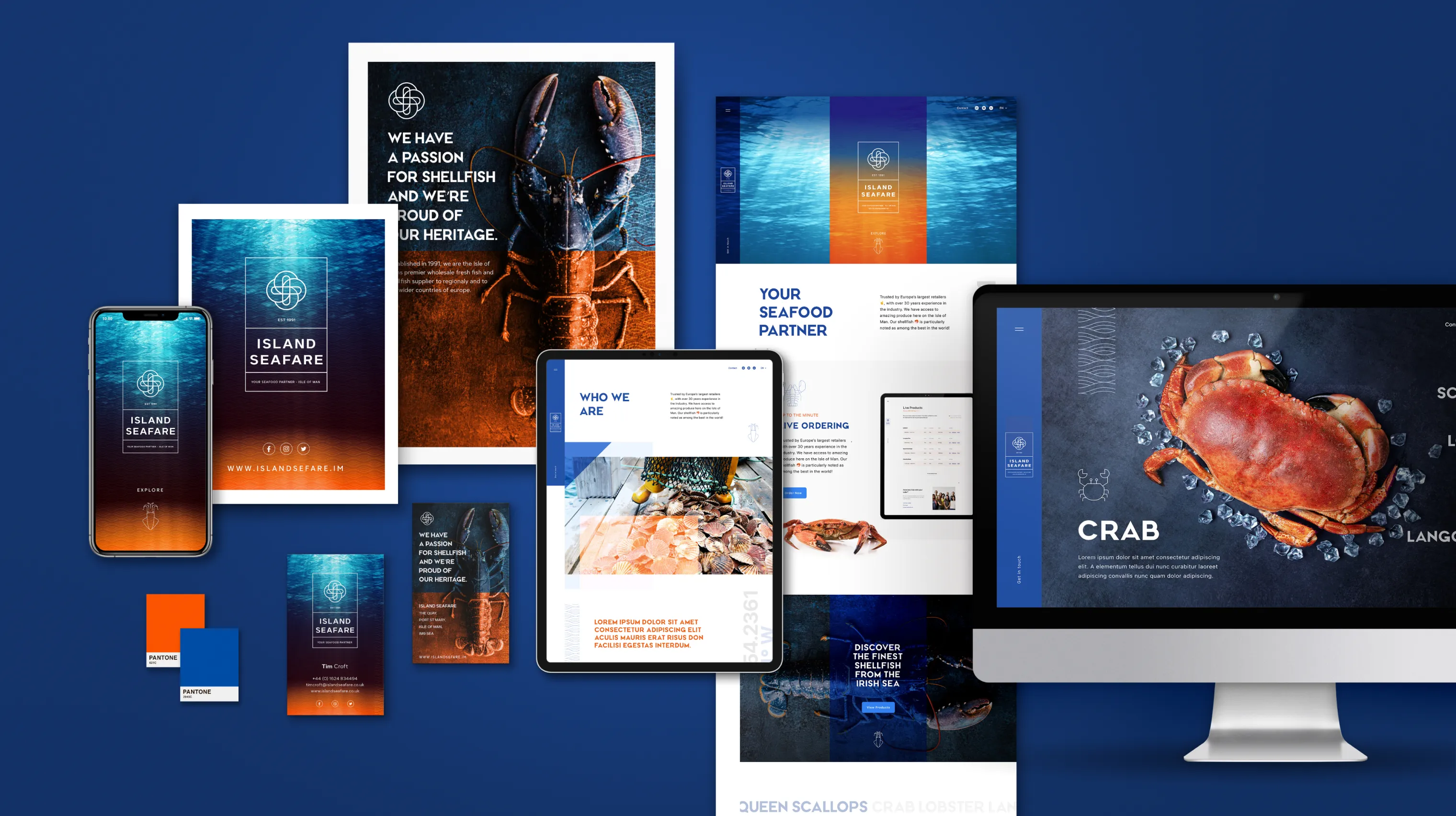
The platform
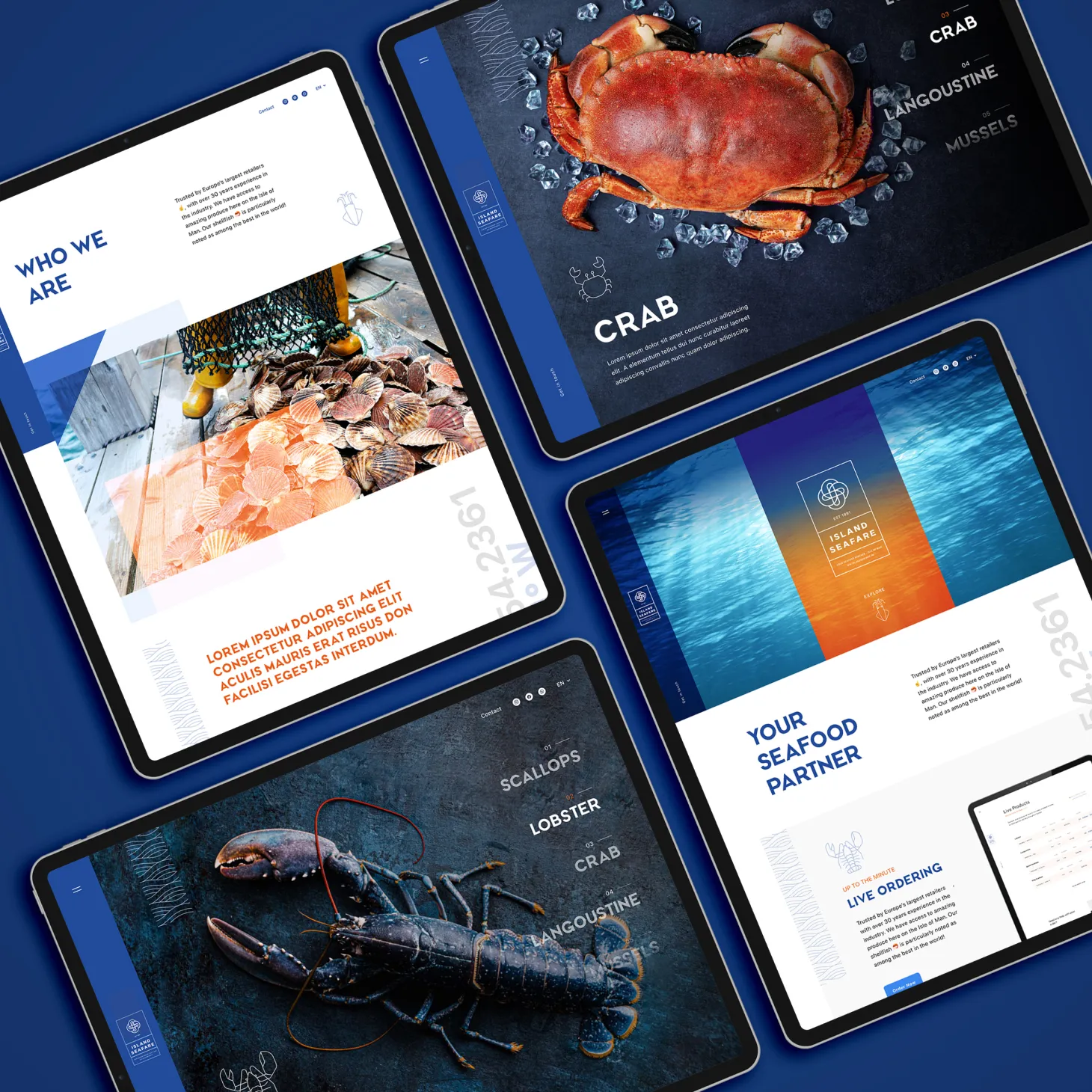
The website was rebuilt from the ground up. Custom-designed and handcrafted to match the rebrand - not a template adapted to fit, but a platform built around how Island Seafare actually does business.
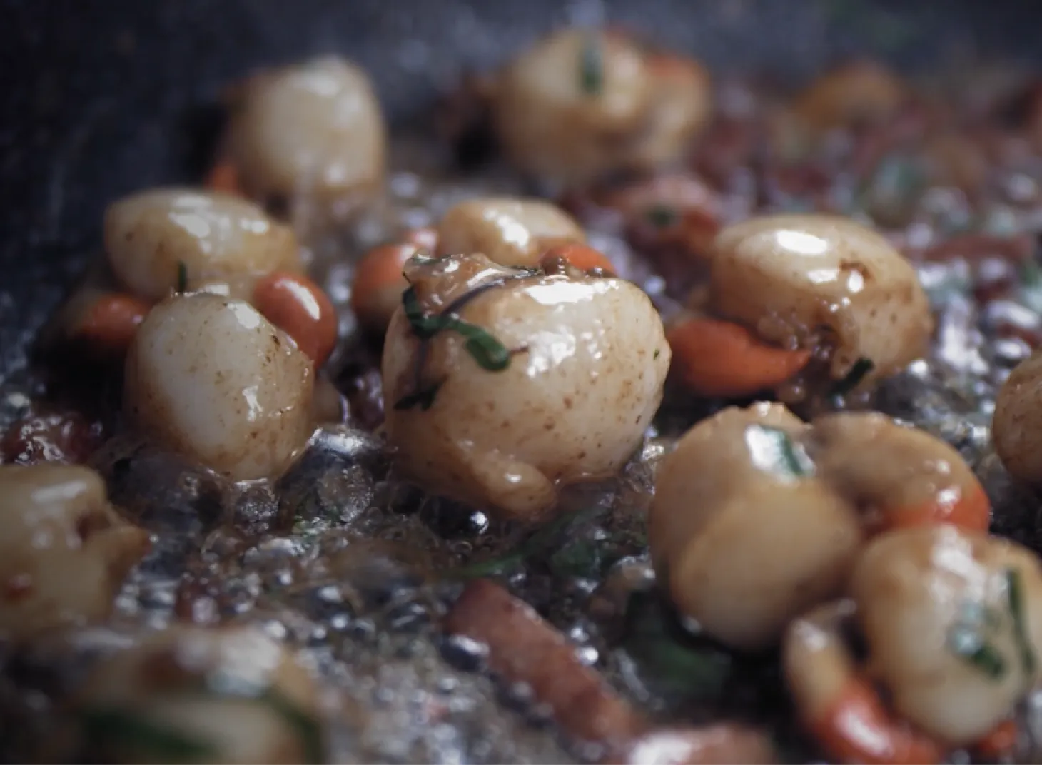
Videography Film that shows the product, the process, and the island behind it. In premium food and seafood markets, video that communicates quality and provenance does work that product photography alone can't.
Streamlined ordering The ordering system was significantly improved - faster, clearer, and designed around the needs of trade buyers operating across multiple markets. Less friction between interest and transaction.
Content and structure Rebuilt around the primary markets - Isle of Man, UK, France, Italy, Spain - with content and structure that serves buyers in each. A site that works as hard internationally as it does at home.
What it means in the market
Island Seafare's rebrand doesn't just update the visual identity. It repositions the business. The monogram carries provenance. The platform handles international trade without friction. The brand communicates what the product has always delivered.
In premium seafood markets, buyers choose suppliers they trust before they've placed a single order. Island Seafare now looks exactly like the business it is.